
TL;DR: Learn how Bauhaus typography evolved from a modernist design movement into a recognizable typographic style, which modern fonts capture the Bauhaus look, and when to use them effectively in contemporary design.
What is the Bauhaus font?
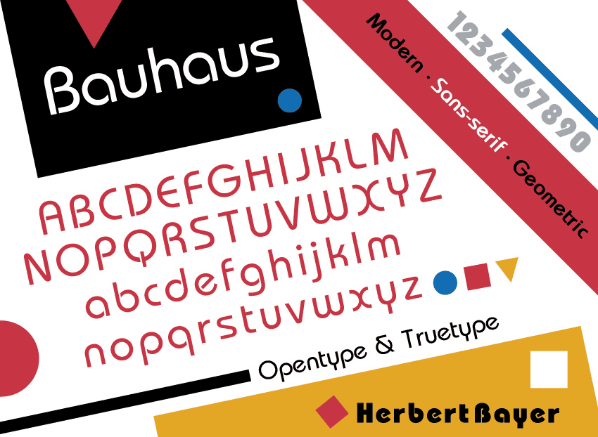
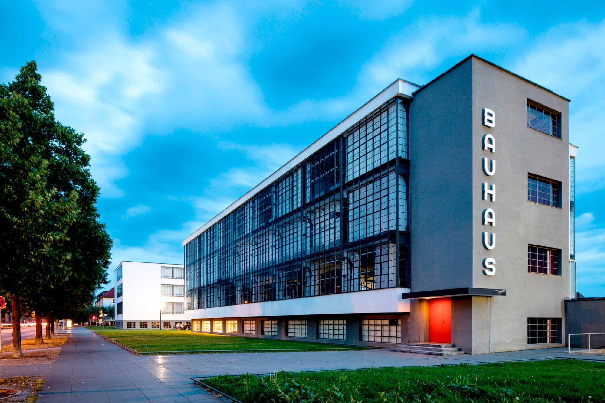
The Bauhaus font is not a single, original typeface but a typographic style rooted in the Bauhaus School of Design, founded in Germany in 1919. Rather than producing a definitive font, the school promoted a functional approach to letterforms based on geometry, simplicity, and clarity.
Bauhaus-style typography is defined by clean geometric construction, minimal ornamentation, and consistent strokes. Built from basic shapes such as circles and straight lines, these letterforms feel modern, structured, and highly readable, particularly at display sizes.
Today, designers use Bauhaus-inspired fonts for branding, logos, headlines, and digital interfaces where strong hierarchy and visual impact matter most. In 2026, this visual language continues to influence typography, branding, and digital design. nearly a century after its origins.
The origins of Bauhaus typography
Bauhaus typography began as an experimental idea, not a commercial font.
In 1925, designer Herbert Bayer developed the concept of the Universal typeface while teaching at the Bauhaus school in Germany. His unicase alphabet removed traditional distinctions between uppercase and lowercase letters, favoring pure geometry and functional clarity. Although Universal was never released as a finished font, it became a defining visual expression of Bauhaus design principles.
From concept to commercial type
Bauhaus ideas entered commercial typography decades later.
In the late 1960s and early 1970s, designer Joe Taylor created a typeface inspired by Bayer’s work for the Fotostar foundry. This interpretation introduced uppercase characters and more conventional proportions while preserving the geometric spirit of the original concept.
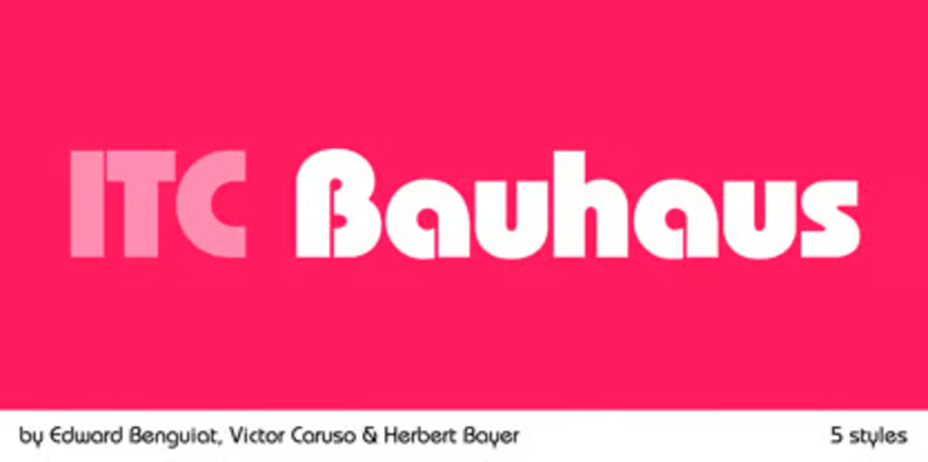
The design was later refined by Ed Benguiat and Victor Caruso at the International Typeface Corporation (ITC), resulting in ITC Bauhaus—a professional, multi-weight type family that helped popularize the Bauhaus look in modern graphic design.
Bauhaus in the digital era
The Bauhaus aesthetic became widely recognizable in the 1990s.
A simplified digital typeface known as Bauhaus 93 spread through desktop publishing software and operating systems. While not historically connected to the Bauhaus school, its accessibility helped establish Bauhaus-style typography as a familiar visual language rather than a single historical font.
In 2026, Bauhaus-style fonts are usually used in web or print design projects, especially for logos, visual identities, and headlines that aim to feel bold, structured, and timeless.
16 high-quality fonts similar to Bauhaus
If you’re searching for fonts similar to Bauhaus, this curated collection has you covered.Featuring up to 16 typefaces that echo this iconic style, you can explore and download all of them through Envato—perfect for your next project or creative experiment.
1. Redtone
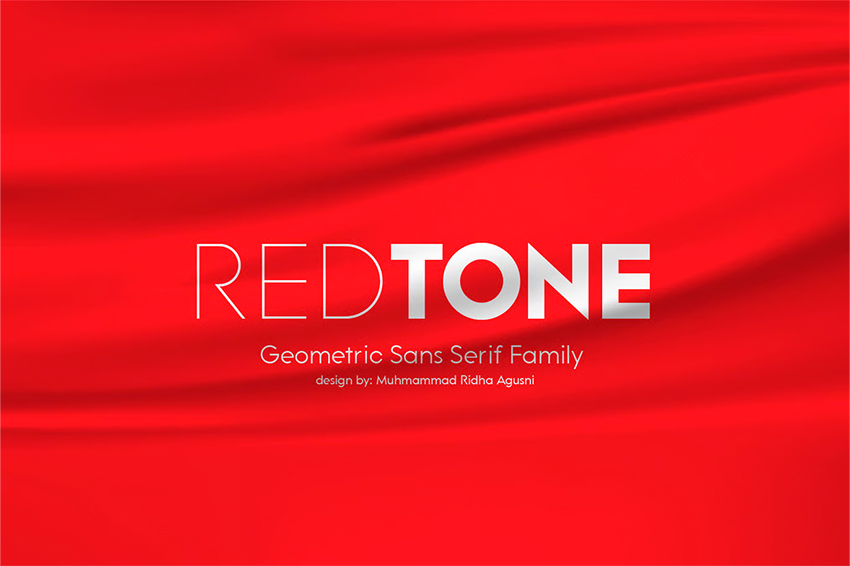
Redtone is a contemporary geometric sans-serif font that interprets Bauhaus principles through precision and flexibility rather than nostalgia. Instead of leaning heavily into retro forms, it uses near-perfect circular shapes and carefully controlled proportions to create a system that feels modern and adaptable.
Best fit if you’re designing for…
Clarity, structure, and strong on-screen legibility in digital-first design work, especially in:
- Tech and SaaS branding, UI systems, apps, and digital products where readability and hierarchy are essential
- Minimal or premium brands and packaging built around clean layouts and confident headlines
- Architecture and interior design projects that rely on structured visual systems and editorial polish
- Editorial and digital layouts, such as online magazines, lookbooks, and portfolios, with a clear hierarchy
- Podcast covers and album artwork where typography needs to remain clear at smaller sizes
- Lifestyle, streetwear, and urban brands that need a sharp, modern look without losing edge
Format: OTF, TTF, WOFF
2. Bergen Sans
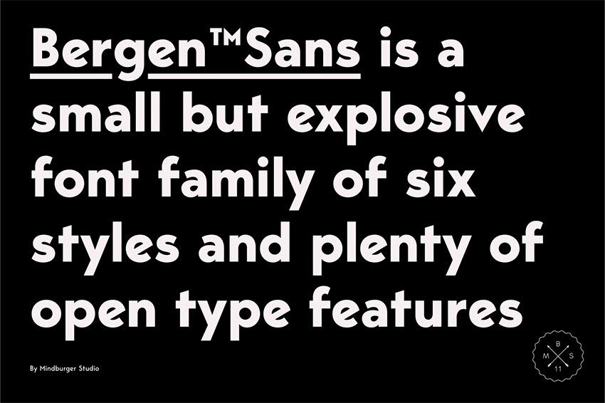
Bergen Sans is a clean, geometric sans-serif that draws on Bauhaus principles while leaning into a more expressive, contemporary tone. Built on circular forms and consistent stroke widths, it balances functional clarity with a bolder visual presence, making it feel confident without slipping into retro pastiche.
Best fit if you’re designing for…
Visual impact, bold presence, and expressive typography, particularly for:
- High-impact advertising and bold messaging, such as social media campaigns, posters, and digital ads, where type needs to stop the scroll quickly
- Streetwear and urban fashion branding, including logos, packaging, and fashion websites that aim to feel modern, confident, and unapologetically bold
- Expressive UI and digital products such as music apps, gaming platforms, and experimental digital magazines that rely on strong typographic headlines
- Contemporary editorial design, from opinion-led headlines to art magazines and non-fiction book covers that rely on strong hierarchy and visual personality
- Creative projects with vibrant color palettes where short, punchy phrases need to feel energetic, dominant, and visually striking
Format: OTF
3. Causten
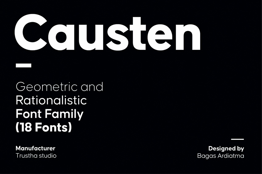
Causten is a clean geometric sans-serif built around precision, balance, and system consistency. While its structure reflects Bauhaus-inspired geometry, its real strength lies in its calm, reliable performance across large typographic systems. With nine weights and matching obliques, Causten is designed to scale smoothly from headlines to body text without losing clarity or cohesion.
Best fit if you’re designing for…
Consistency at scale, strong legibility, and a rational, trustworthy typographic system, with a strong focus on:
- Corporate identity and fintech branding, including logos, marketing materials, and formal documentation, where consistency across many touchpoints is critical
- Complex design systems for web and mobile, such as dashboards, educational platforms, and data-heavy interfaces that demand clarity and structure
- Editorial projects and annual reports, including business magazines, sustainability reports, and corporate publications with a refined, professional tone
- Information-driven layouts where multiple weights create a clear hierarchy, from confident headlines to clean, readable body text
- Signage and wayfinding systems for museums, airports, and office buildings that rely on clean geometry and distraction-free communication
Format: OTF
4. Elpi
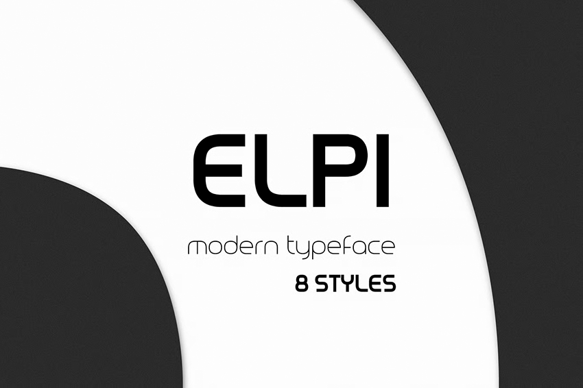
Elpi is a minimalist geometric sans-serif typeface that interprets Bauhaus-inspired forms through a softer, more fluid approach. Rooted in clean geometry and uniform strokes, it strips typography down to its essentials while avoiding the rigidity often associated with strictly rationalist designs. The result is a typeface that feels modern and futuristic, yet approachable rather than cold.
Best fit if you’re designing for…
Calm modernity, soft futurism, and clean geometry with a human touch, such as:
- Tech startups, digital products, and app interfaces that want a forward-looking aesthetic without feeling harsh or overwhelming
- Video game branding, sci-fi or cyber-inspired posters, and speculative design projects that rely on minimal forms rather than visual noise
- Consumer electronics and smart gadgets, including packaging and interface design, where clarity and refinement go hand in hand
- Contemporary editorial layouts and creative portfolios that need a polished, modern presence with a subtle personality
- Lifestyle-driven digital experiences where lighter weights create softness, rhythm, and visual balance
Format: OTF, TTF, WOFF
5. Yampu
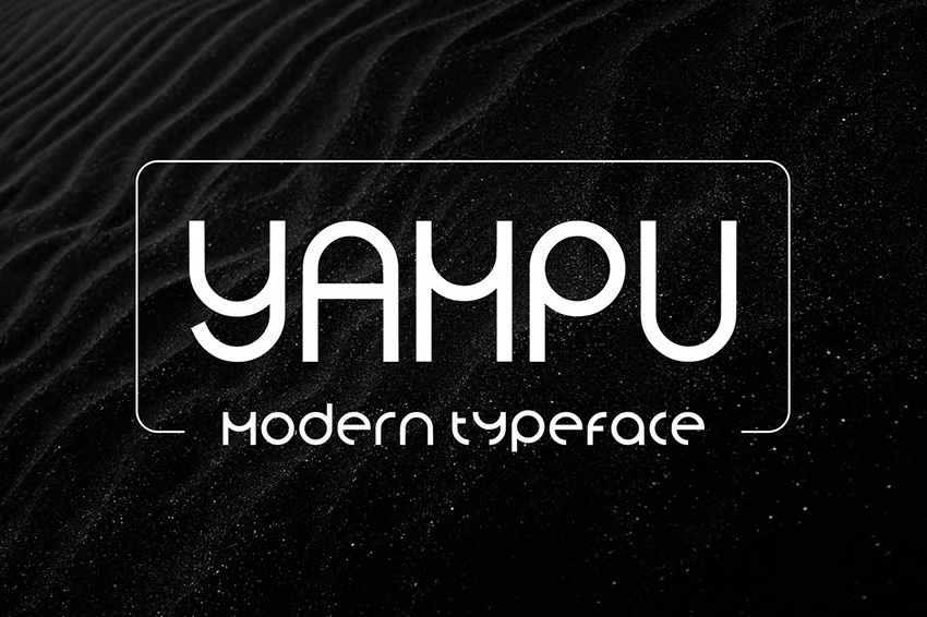
Yampu is an expressive geometric display font resembling Bauhaus aesthetics, designed to function as a visual statement rather than a full typographic system. Although it comes in a single weight, its playful construction and strong forms give it a distinctive personality that works best at large sizes, where structure and expression take center stage.
Best fit if you’re designing for…
Experimentation, strong visual personality, and typography as a graphic element, with applications including:
- Festival posters and cultural event identities, from electronic music to contemporary art and digital exhibitions
- Fashion, beauty, and niche cosmetic branding, including unisex perfumes and luxury skincare with an unconventional, design-led edge
- Magazine covers and editorial titles where oversized typography drives the visual language
- Creative studio and agency logos for teams positioning themselves as bold, conceptual, and forward-thinking
- Art-driven visual systems where typography plays an expressive, decorative role rather than a purely functional one
Format: OTF, TTF, WOFF
6. Magnify
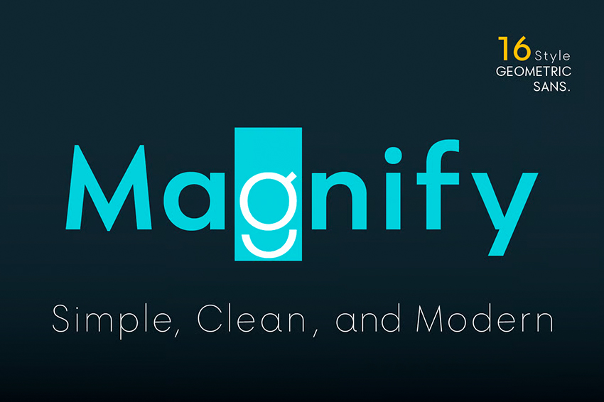
Magnify is a geometric sans-serif fontdesigned around clarity, balance, and long-term usability. Shaped by circular forms and precise straight cuts, Magnify draws from Bauhaus principles while maintaining a neutral, contemporary tone that feels professional rather than expressive.
With eight weights and matching obliques, Magnify functions comfortably across a wide range of design contexts, from headlines to extended content.
Best fit if you’re designing for…
Timeless minimalism, geometric clarity, and a contemporary corporate feel, such as:
- Next-generation corporate branding for consultancies, modern law firms, and technology companies that want to feel established yet current
- UX/UI systems and mobile apps where high legibility and simple construction support everything from navigation to long-form content
- Editorial layouts for print and digital centered on clean grids, confident hierarchy, and restrained typography
- Sustainable and eco-friendly packaging for organic products and natural cosmetics, where clarity and restraint reinforce brand values
- Scalable visual identities inspired by classic geometric sans-serifs with a modern, dependable edge
Format: TTF
7. Altone
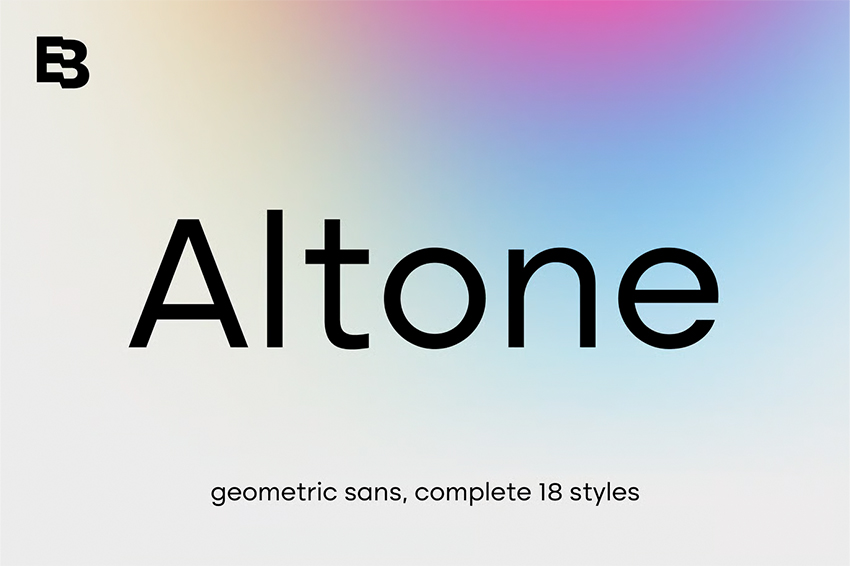
Altone is a geometric grotesk sans-serif designed for clarity, balance, and refined neutrality.Shaped by fundamental geometric forms and carefully balanced proportions, it aligns with Bauhaus-era construction while maintaining a polished, contemporary tone suited to professional, global-facing design work. Including nine weights and matching obliques, Altone adapts easily across branding systems without calling attention to itself.
Best fit if you’re designing for…
Scalability, clarity, and a refined global aesthetic, especially in:
- Global corporate branding systems where large families support everything from confident logos to cohesive stationery and websites
- Lifestyle and travel-focused apps such as city guides, boutique hotels, and experiential platforms with a clean, aspirational tone
- High-end UI and digital interfaces, including productivity tools and fashion-forward e-commerce, that require long-term legibility
- Museum and gallery signage where clean geometry keeps information clear, calm, and elegant
- Premium, information-heavy environments where consistency and restraint elevate the overall experience
Format: TTF
8. Normal
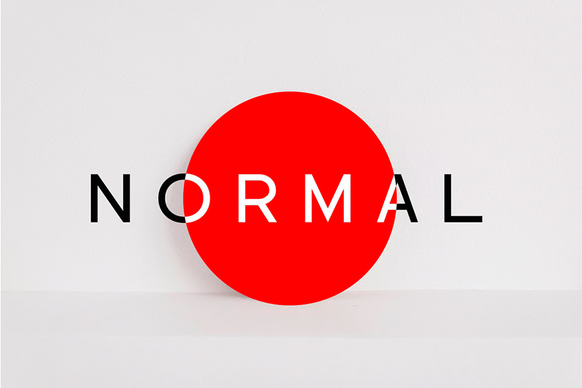
Normal is a minimalist sans-serif with a distinctly understated character. Drawing on rational proportions and essential forms, it balances geometric precision with subtle personality, creating a typeface that feels intentional, modern, and quietly confident. Available in five weights from ExtraLight to ExtraBold, Normal delivers clarity without visual excess.
Best fit if you’re designing for…
Radical minimalism, geometric precision, and quiet luxury, for use in:
- High-fashion photography and luxury editorial covers where typography supports imagery without competing for attention
- Museum and contemporary art gallery branding, including logos and exhibition materials featuring white space and typographic purity
- Architecture and industrial design identities for studios that value structure, proportion, and timeless geometric systems
- Minimalist signage and architectural applications, such as engraved wayfinding, where precision and materiality are essential
- Clean beauty and science-led cosmetic brands where purity, transparency, and restraint define the visual language
Format: OTF, TTF, WOFF
9. Géorge
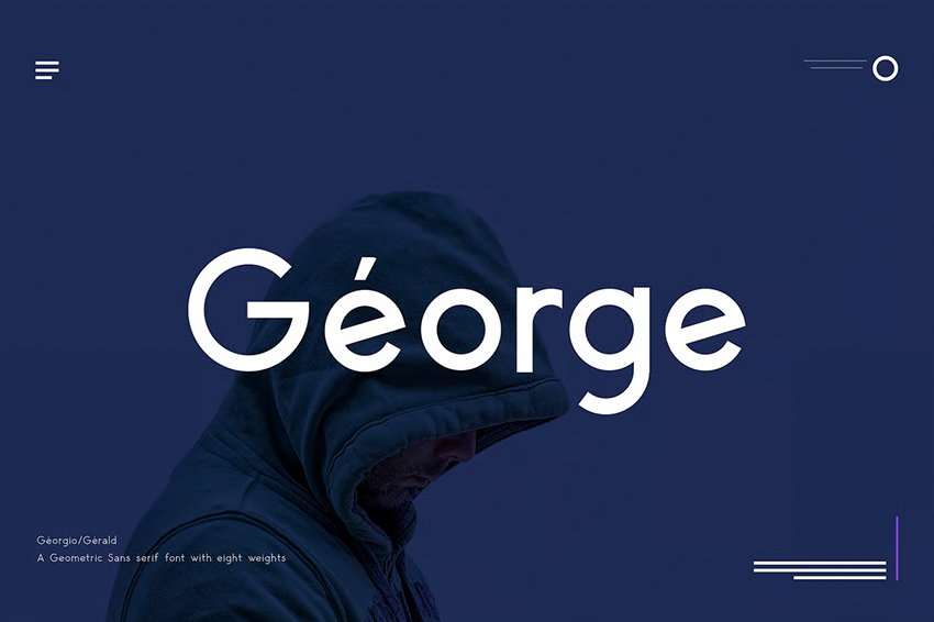
Géorge is a contemporary geometric sans-serif that balances architectural structure with approachability. It echoes Bauhaus geometry through precise, well-balanced forms, yet feels firmly grounded in modern digital design rather than a retro revival. Its versatility allows it to perform comfortably in both body text and headlines, making it a flexible choice for structured yet friendly layouts.
Best fit if you’re designing for…
Clarity, modernity, and a versatile geometric voice made for digital-first use, particularly for:
- User interfaces for apps and web platforms, including music and streaming services that require strong contrast and high legibility on vibrant screens
- Contemporary fashion and lifestyle branding that balances minimalism with a chic, approachable edge
- Outdoor advertising and digital banners, such as festival promotions or tech campaigns where multiple weights create bold typographic contrast
- Digital magazine covers and editorial layouts where large headlines feel clean, structured, and confidently modern
- Youth-forward visual identities that communicate freshness and innovation while remaining polished and readable
Format: OTF, TTF, WOFF
10. Autorich Sans
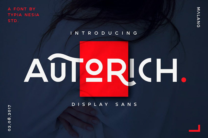
Autorich is an all-caps geometric display typeface that reflects Bauhaus construction while leaning into a more decorative, statement-driven direction. Constructed from circles and straight lines and released in two distinct uppercase letter sets, it is designed for visual impact rather than long-form readability. Its stylized forms and subtle Art Deco influence give Autorich a confident, fashion-forward presence.
Best fit if you’re designing for…
Bold personality, bespoke detail, and typography as the visual centerpiece, such as:
- Signature logos and wordmarks where distinctive letterforms create instant brand recognition
- Luxury and lifestyle branding such as fragrances, contemporary jewelry, and artisanal spirits with a confident, modern edge
- Avant-garde editorial design for architecture, design, and culture magazines that treat typography as a graphic statement
- High-end events and exclusive experiences, including galas, fashion shows, and premium product launches, where typography signals exclusivity
Format: OTF, TTF, WOFF
11. Pure Mechanic
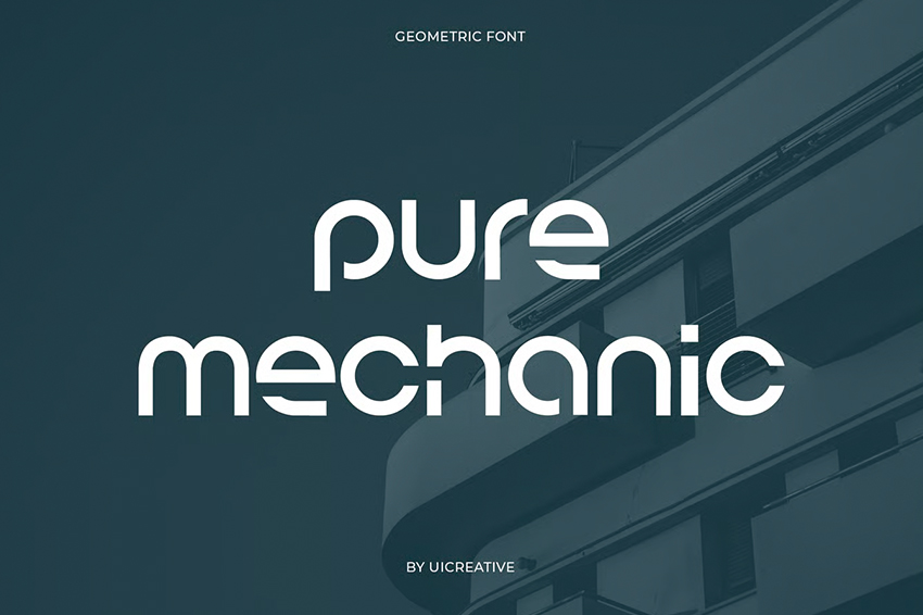
Pure Mechanic is a geometric sans-serif with a distinctly engineered, industrial character. Defined by strict geometric modules and sharp cuts, it recalls Bauhaus-style construction while pushing the aesthetic toward a more futuristic, mechanical direction. Pure Mechanic has a balance of strength and refinement, which gives the typeface a confident presence that feels technical without becoming overly rigid.
Best fit if you’re designing for…
A futuristic, mechanical aesthetic driven by precision, structure, and technology, particularly for:
- Gaming and eSports branding, including team identities, sci-fi interfaces, and digital assets that emphasize speed and competition
- Engineering, robotics, and hardware-driven brands such as drone companies, automation startups, and AI or robotics prototypes
- High-tech architecture and future-facing infrastructure, from research labs and data centers to speculative design publications
- Electric and autonomous automotive design, including digital dashboards, in-car UI systems, and next-generation vehicle campaigns
- Technology-forward visual identities where geometric cuts, negative space, and modular systems reinforce precision and control
Format: OTF, TTF, WOFF
12. Regime Grotesk
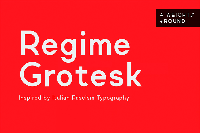
Regime Grotesk is a bold grotesk sans-serif font defined by discipline, structure, and visual authority. Drawing on Bauhaus geometry and early 20th-century European design traditions, its construction feels controlled and intentional rather than decorative. With four weights, Regime Grotesk delivers a strong, grounded presence that works best when typography needs to carry meaning, tone, and emphasis.
Best fit if you’re designing for…
Strong visual authority, historical weight, and a bold grotesk voice rooted in modernist design, with a strong focus on:
- Opinion-led editorial and historical publications, including magazines focused on politics, sociology, and cultural analysis, that require typographic gravitas
- Film posters, documentary titles, and visual campaigns exploring political tension, social movements, or historical conflict
- Streetwear and urban brands using bold typography as a statement rather than decoration
- Museum, archive, and institutional branding for exhibitions and cultural spaces that reference specific historical periods
- Conceptual visual systems where rigid forms deliver impact, with limited weights reinforcing consistency and control
Format: TTF
13. Jaileq
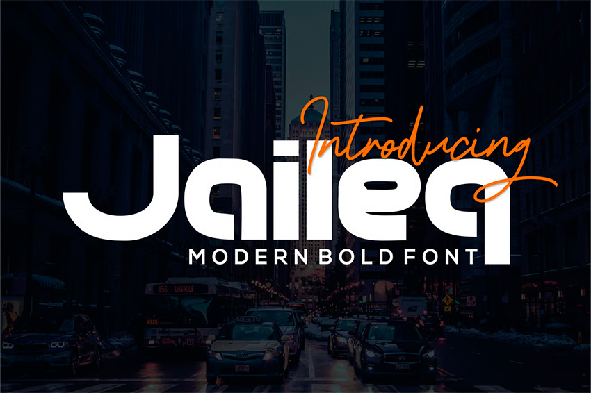
Jaileq is a bold geometric sans-serif defined by heavy weight, wide proportions, and uncompromising visual strength.This font follows a rigid geometric construction and simplified letter anatomy; it channels Bauhaus-era construction logic into a typeface designed to dominate space rather than blend in. Its thick strokes and controlled negative space ensure clarity even at extreme sizes.
Best fit if you’re designing for…
Maximum impact, structural strength, and typography designed to command attention, such as:
- Large-scale advertising and billboards where extreme weight and wide forms remain legible from a distance
- Construction, engineering, and industrial branding for companies that need to signal durability, power, and technical reliability
- Business, finance, and economics magazine covers where oversized headlines must feel authoritative and confident
- Sports, fitness, and performance-driven merchandising, including apparel and packaging that rely on bold typographic presence
- Brands that lead with strength and stability, using typography that feels grounded, direct, and unapologetically bold
Format: OTF, TTF
14. Oliviar Regular
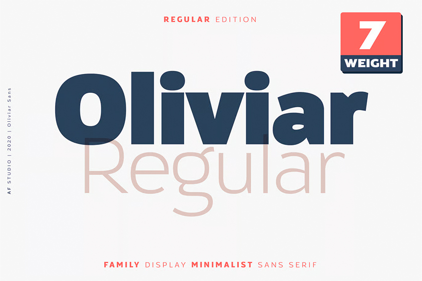
Another font similar to Bauhaus is Oliviar Regular. This modern, geometric sans-serif that balances precision with visual warmth. Oliviar is defined by clean, simplified forms, softened through generous spacing and calm proportions. Available in seven weights ranging from Thin to Bold, it feels refined and contemporary without becoming cold or overly rigid.
Best fit if you’re designing for…
Organic elegance, modern restraint, and warmth, especially in:
- Skincare, beauty, and wellness branding, including natural cosmetics, spas, and self-care products focused on purity and calm
- Residential interior design and architecture, from Scandinavian-inspired catalogs to studios creating light-filled, contemporary spaces
- Lifestyle editorial design for travel, food, and fashion titles where subtle hierarchy and quiet confidence matter
- Elegant invitations and high-end events such as modern weddings, gala dinners, and premium social stationery
- Creative personal brands that balance warmth, polish, and approachability within a clean visual system
Format: OTF
15. Darbots
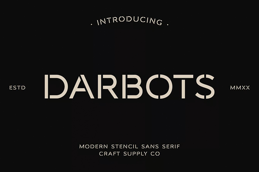
Darbots is a modern stencil-style geometric sans-serif that combines industrial structure with refined contemporary design. Shaped by clean geometric forms and precise cuts, it references Bauhaus construction while using stencil details as a deliberate graphic feature rather than a purely functional one. The result is a typeface that feels controlled, intentional, and quietly sophisticated.
Best fit if you’re designing for…
Industrial precision paired with refined minimalism, using stencil details in a modern way, such as:
- Luxury industrial branding for design studios, steel furniture, and architectural lighting brands that value craftsmanship and structure
- Creative workspace signage and wayfinding for coworking spaces, studios, and workshops where clarity meets a subtle artistic edge
- Modern craft and artisanal packaging, from specialty coffee and craft beer to minimalist candles and small-batch products
- Architectural and engineering identities where geometric construction and precise cuts signal technical expertise
- Brands rooted in making and fabrication that reference production and materiality without feeling utilitarian
Format: OTF, TTF
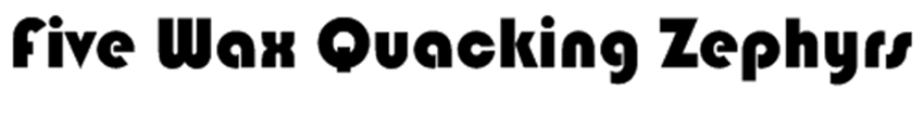
16. Bahuss
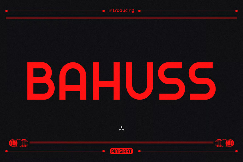
Bahuss is a geometric sans-serif that delivers a bold, high-energy reinterpretation of Bauhaus typography. Built entirely from basic geometric forms and uniform stroke weights, it takes the movement’s functional logic and amplifies it into a far more intense, contemporary expression. The result feels unapologetic and powerful, designed to make typography the focal point rather than a supporting element.
Best fit if you’re designing for…
A high-impact, contemporary take on Bauhaus geometry, especially in:
- Electronic music and techno visuals, including festival posters, club flyers, and album covers driven by rhythm and repetition
- Extreme sports and motorsport branding for racing teams, gear, and performance-focused labels driven by speed and power
- Avant-garde editorial design and independent zines centered on urban culture and experimental ideas
- High-impact streetwear graphics, particularly large-scale prints for hoodies and T-shirts, where typography must dominate
- Youth-driven visual systems that use aggressive geometry and saturated color for an unapologetic presence
Format: OTF, TTF, WOFF
Bonus: Bauxify
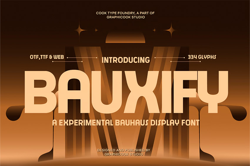
Bauxify is an experimental display typeface that channels the artistic and exploratory side of Bauhaus typography. Designed with expressive intent, it prioritizes bold visual construction over neutrality, resulting in letterforms that feel closer to modern art objects than conventional branding tools. Its heavy, modular forms create a strong graphic presence, making typography the central visual element.
Best fit if you’re designing for…
High-impact applications, experimentation, and typography as an artistic statement, especially in:
- Avant-garde logo design where expressive letterforms support art-led and concept-driven identities
- Design event posters and visual identities for fairs, biennials, and exhibitions where typography takes center stage
- Art and theory book covers focused on design history, visual culture, and artist monographs with strong conceptual weight
- Experimental animation and motion graphics that benefit from modular construction and geometric cuts
- Conceptual visual systems where typography is meant to be explored, interpreted, and experienced, not just read
Format: OTF, TTF, WOFF
How to choose the right font similar to Bauhaus
Choosing the right Bauhaus-style font isn’t about sticking to a strict visual rulebook. It’s about knowing when geometric clarity and functional form actually add value to your design, and when they don’t.
Before committing to a font, keep these principles in mind:
- Match the font to the tone of your project. Clean, neutral families work best for systems and long-form layouts, while bolder, more expressive fonts shine in branding, posters, and headline-driven work.
- Test fonts at real usage sizes. Many Bauhaus-style fonts look great at display scale but lose clarity in UI or body text. Always check how they perform where they’ll actually live.
- Look beyond a single weight. Larger families give you flexibility across layouts, hierarchy, and responsive designs, especially in complex projects.
All the fonts featured in this guide are high-quality, versatile, and suitable for professional use. Even better, they’re all available with an Envato subscription, giving you unlimited access to fonts, graphics, templates, photos, and access to AI tools to support your workflow from start to finish.
Want to keep exploring strong typographic styles? You might also enjoy these font collections:
- 15 Fonts Similar to Muro
- 14+ Fonts Similar to Bebas Neue
- Fonts Similar to Rockwell
- 16 Fonts Similar to Cern
Fonts similar to Bauhaus FAQs
Why is Bauhaus popular in design?
Why is Bauhaus popular in design?
Bauhaus is popular because it revolutionized design by prioritizing clarity, function, and simplicity over decoration. Founded in the 1920s in Germany, the movement introduced a geometric, minimal design language that still feels timeless and works just as well in modern branding and digital design.
Is Bauhaus a font?
Is Bauhaus a font?
Bauhaus is a design movement, not a single original font.
While typefaces such as ITC Bauhaus and Bauhaus 93 exist, they are later interpretations inspired by the movement’s geometric principles rather than fonts created by the Bauhaus school itself.
What projects use Bauhaus-style design most often?
What projects use Bauhaus-style design most often?
Bauhaus-style design is commonly used in branding, logos, and display typography.
It’s especially effective for posters, editorial layouts, signage, packaging, and modern web design where strong structure and visual impact matter.
Is ITC Bauhaus free to use?
Is ITC Bauhaus free to use?
ITC Bauhaus is a commercial typeface and requires a license for use.
It’s not free by default, but it can be used legally through licensed platforms or font providers. Envato provides access to Bauhaus-inspired fonts under a commercial license, making them suitable for both personal and professional projects.
Is Bauhaus 93 free to use?
Is Bauhaus 93 free to use?
Bauhaus 93 is a commercial typeface and is not free for unrestricted use.
Although it is often preinstalled on some systems or widely distributed online, its usage rights depend on the license under which it was obtained. Designers should always check the font’s licensing terms before using Bauhaus 93 in commercial projects.
Is Bauhaus good for body text?
Is Bauhaus good for body text?
Bauhaus-style fonts are better suited for headlines than long body text.
Their geometric forms work best at larger sizes, so designers often pair them with neutral sans-serif fonts such as Montserrat, Helvetica, or Open Sans for body copy.