
TL;DR: Serif fonts are typefaces that feature small decorative strokes or “serifs” at the ends of letters, giving text a more classic, readable look. The main types of serif fonts include Old Style, Transitional, Didone, and Slab Serif, each with distinct structures and moods. Modern design also features hybrid serifs that mix traditional elegance with contemporary flair.
Serif fonts come in many shapes and personalities, from elegant Didones to sturdy Slab Serifs, and knowing the difference can transform how you approach typography. In this tutorial, we’ll break down the main types of serif typefaces, explore what makes each unique, and show real-world examples of how designers use them to shape mood and readability.
You’ll also discover how to spot the subtle details, such as bracketed curves or angular terminals that define each style, plus where to find and download modern serif fonts to bring fresh character to your next design project.
What is a serif font?
So, what exactly is a serif font? Let’s start with the basics. A serif refers to the small decorative line or stroke that extends from the ends of a letter’s main strokes. These subtle details give typefaces a more traditional, structured, and readable feel, especially in print.
For example, Times New Roman is a serif typeface. Notice how each letter features small finishing strokes at its edges; that’s the serif in action. In contrast, Helvetica is a sans-serif typeface, meaning “without serif.” Its clean, straight letter endings give it a more modern, minimal look.

When comparing the two, serif fonts often feel classic, elegant, and literary, while sans serif fonts lean modern, sleek, and digital-friendly. Both have their place, but understanding what makes a serif font distinct helps you choose the right tone and texture for your design.
But not all serif fonts look the same. They come in a wide range of shapes, weights, and personalities, from bold slab serifs with strong geometric forms to delicate hairline serifs that feel refined and elegant. You’ll even find handwritten serif styles that blend calligraphic charm with classic structure.
Still, the basic distinction remains one of the most universal ways to classify type: a font is usually either serif or sans serif. Occasionally, you’ll see script fonts described as a “third category,” but even then, they often carry characteristics that fit into the serif or sans serif families. Understanding this simple division is the first step to navigating the rich world of typography.
What is type classification?
So, what are the different types of serif fonts? To answer that, we first need to understand type classification, a system for grouping fonts based on their shared visual characteristics and historical origins.
These classifications help designers recognize subtle differences in letterform shapes, stroke contrast, and proportions. While many of today’s fonts blur the lines between categories, most still draw inspiration from traditional type design eras, each with its own personality and purpose.
Type classification isn’t just academic; it’s practical. Knowing whether a font belongs to the Old Style, Transitional, or Modern family, for example, can help you choose the right tone for your project, whether you’re designing a classic print layout or a clean digital interface.
Want to dive deeper? Check out this free course on Envato Tuts+ for a complete breakdown of type classifications, covering both serif and sans serif fonts, with plenty of real-world examples to help you spot the differences.
Why does it matter?
Why learn about the different types of serif typefaces? Isn’t choosing a font just about what looks good? Well, as any seasoned designer will tell you, it’s a bit more nuanced than that.
Understanding type classification and characteristics gives you the tools to make intentional design choices. When you can recognize a font’s structure, its contrast, proportions, and details, you’re not guessing anymore. You’re selecting type with purpose.
Knowing how to identify a font’s traits also helps you choose the right typeface faster. Instead of scrolling endlessly or relying solely on instinct, you can start with a clear visual direction that supports your concept and brand tone.
Typography isn’t just decoration; it’s communication. The fonts you choose set mood, tell stories, and shape perception. Recognizing those subtle differences is what transforms a good layout into one that feels cohesive, expressive, and uniquely yours.
The different types of serif fonts
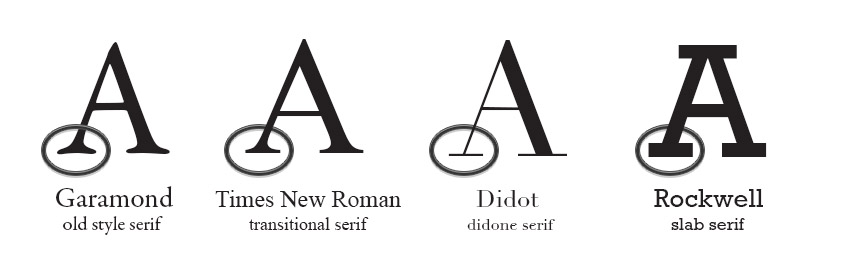
Serif fonts aren’t all built the same. In fact, designers often group them into four main categories: Old Style, Transitional, Didone, and Slab Serif. Each one carries its own history, structure, and personality.
Serif type |
Description |
Example |
|---|---|---|
| Old Style | These are the classics. Old-style serif fonts feature gentle curves, moderate contrast between thick and thin strokes, and a warm, hand-drawn feel rooted in Renaissance calligraphy. | Garamond or Bembo |
| Transitional | Transitional serifs bridge traditional and modern design, with sharper edges and more defined contrast. They feel balanced, readable, and timeless. | Times New Roman |
| Didone | Didone typefaces feature high contrast, thin hairlines, and thick verticals, giving them a polished, elegant look. They shine in fashion editorials, luxury branding, and sophisticated layouts. | Didot and Bodoni |
| Slab Serif | Chunky, bold, and geometric; have thick, block-like serifs with little to no stroke contrast. They’re strong, modern, and perfect for headlines or posters that need impact. | Rockwell or Clarendon |
But here’s the fun part: not every serif fits neatly into these boxes. Many modern typefaces mix influences, borrowing structure from one category and character from another. That’s part of what makes typography so creative.
As the old saying goes, know the rules so you can break them well. Once you understand how serifs work, you’ll start to spot hybrids everywhere, fonts that bend tradition to create something entirely new.
Before we dive too deep, let’s pause and explore some of the key types of serif fonts every designer should know.
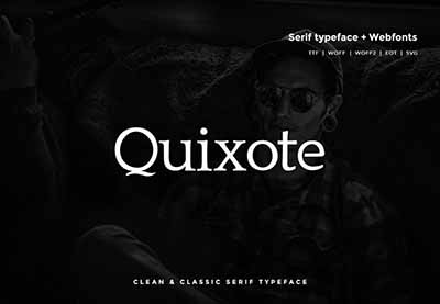
Old-style serif fonts
Old-style serif fonts have a timeless, hand-drawn charm rooted in traditional calligraphy. Their letterforms feel warm and organic, often featuring gentle curves and soft transitions between thick and thin strokes.
You can spot their calligraphic influence in the subtle angles and flowing details, especially in the lowercase “d” or “e”.
Take Garamond, for example. It’s one of the best-known Old-style typefaces, with diagonally stressed strokes that echo the natural rhythm of handwriting. This diagonal stress is a key feature that sets Old Style apart from the later, more upright Transitional serifs.
Here’s an example that captures that same Old-style spirit, refined, readable, and full of quiet elegance.
If you’d like to explore further, check out our curated collection of Old-Style serif fonts, a showcase of classic and contemporary designs inspired by centuries of typographic craftsmanship:
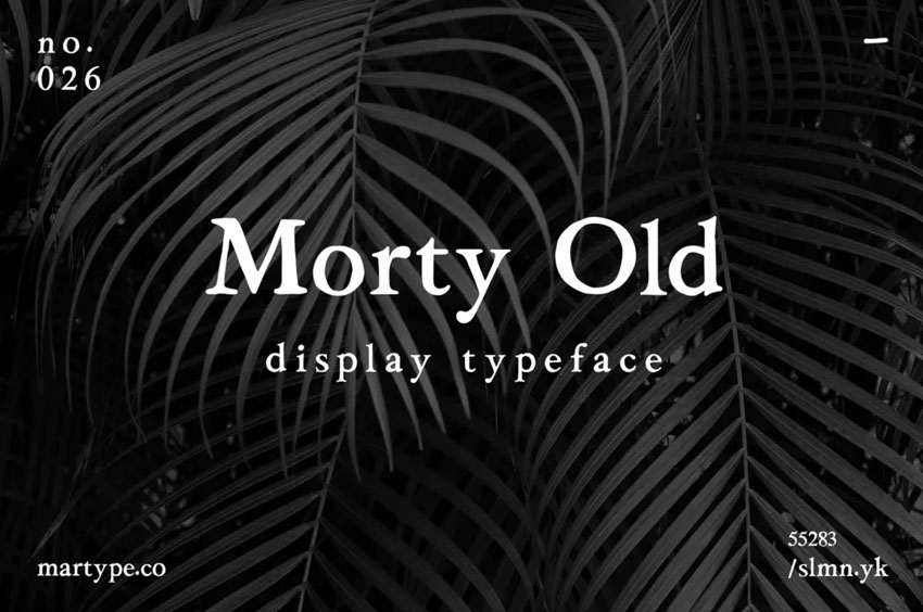
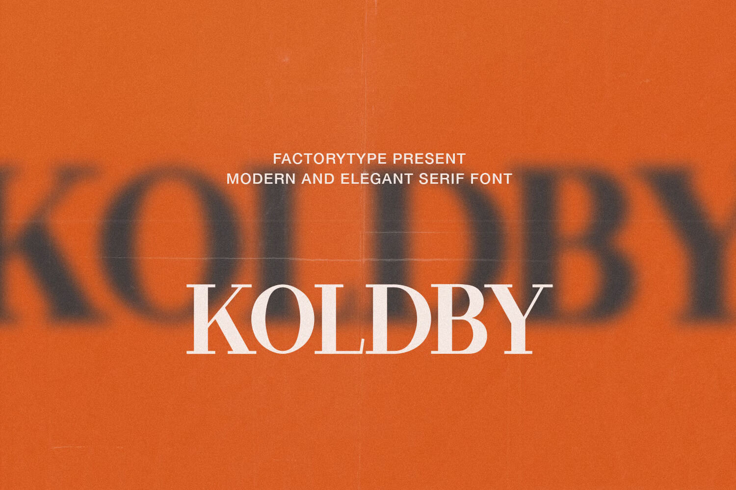
Transitional serif fonts
Transitional serif fonts bridge the gap between the warm, calligraphic curves of Old Style typefaces and the sharper, more refined forms of Modern serifs, such as Didones.
They’re the sweet spot of classic readability and contemporary precision, which is why you’ve likely seen them everywhere.
Familiar favorites such as Baskerville, Times New Roman, and Georgia all belong to this category. Transitional serifs typically feature stronger contrast between thick and thin strokes than Old Style fonts, yet they retain a sense of balance and warmth.
Notice how their serifs still taper gracefully, giving the letters a polished, approachable feel.
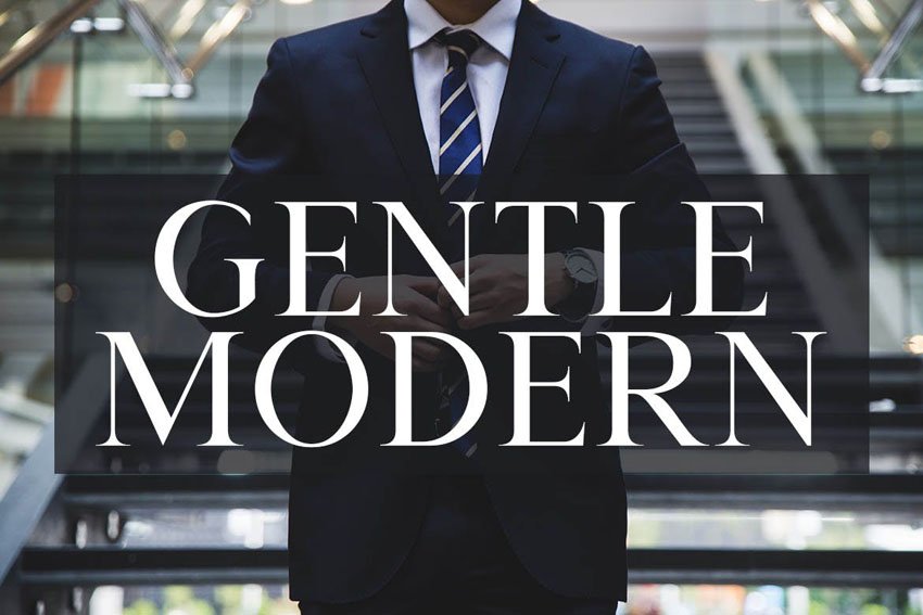
These fonts are highly versatile, perfect for everything from editorial layouts and websites to brand identities that need a touch of sophistication.
Discover even more transitional serif fonts in this curated Envato collection. There’s plenty of inspiration to explore and download for your next design project:

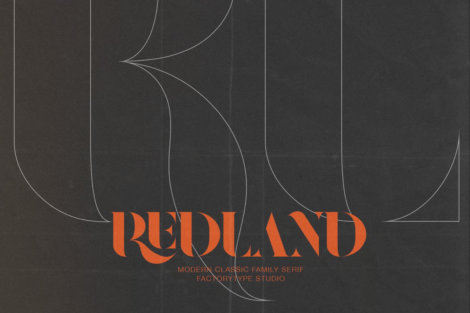
Didone serif fonts
Didone serif fonts are where elegance meets precision. Known for their dramatic contrast between thick and thin strokes, these typefaces feel sleek, modern, and undeniably stylish.
The term “Didone” comes from the great typefounders Didot and Bodoni, whose designs defined this refined aesthetic.
You’ll notice the difference right away: thin, hairline serifs paired with strong vertical strokes that create striking visual tension.
Take a look at the uppercase “N” in many Didone fonts; the verticals are bold and structured, while the horizontal strokes are delicate and razor-thin. It’s that contrast that gives Didones their signature sophistication.
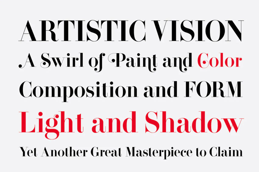
This beautifully designed Didone-inspired font captures that same timeless balance, crisp, elegant, and ideal for editorial headlines, luxury branding, or high-end packaging. Some even include modern, curly alternates for a touch of flourish and personality.
Explore this stunning collection of Didone serif fonts on Envato to find your next statement typeface. Whether you’re creating a magazine layout or an elegant logo, Didones always bring a sense of refinement to the page:

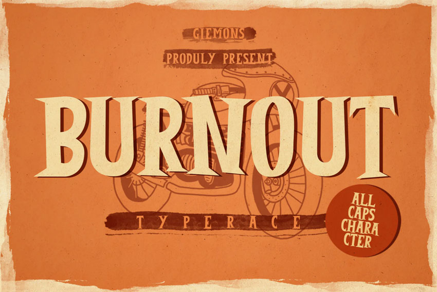
Slab serif fonts
Slab serif fonts look exactly how they sound: bold, blocky, and built to stand out. Unlike Old Style or Didone typefaces, slab serifs have little to no stroke contrast. Instead, their lines remain thick and consistent, giving them a sturdy, architectural feel.
These fonts are a favorite in modern design for a reason. Their bold shapes and solid serifs make them perfect for headlines, titles, logos, and branding that need to make an impact.
Slab serifs can feel industrial and powerful, yet surprisingly versatile, working just as well in minimalist layouts as in retro or editorial settings.
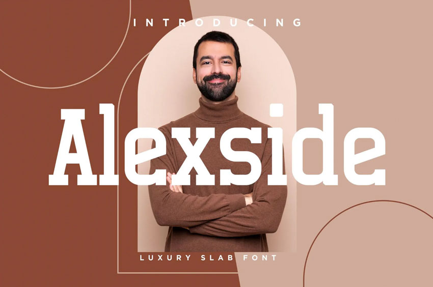
Take this example: a chunky, confident slab serif font that’s made for emphasis. Its strong geometry and clean lines instantly command attention without sacrificing readability.
Explore even more slab serif fonts in this curated Envato collection. Whether you’re designing posters, packaging, or a bold visual identity, slab serifs add structure, weight, and unmistakable personality to your typography:

Other serif terms
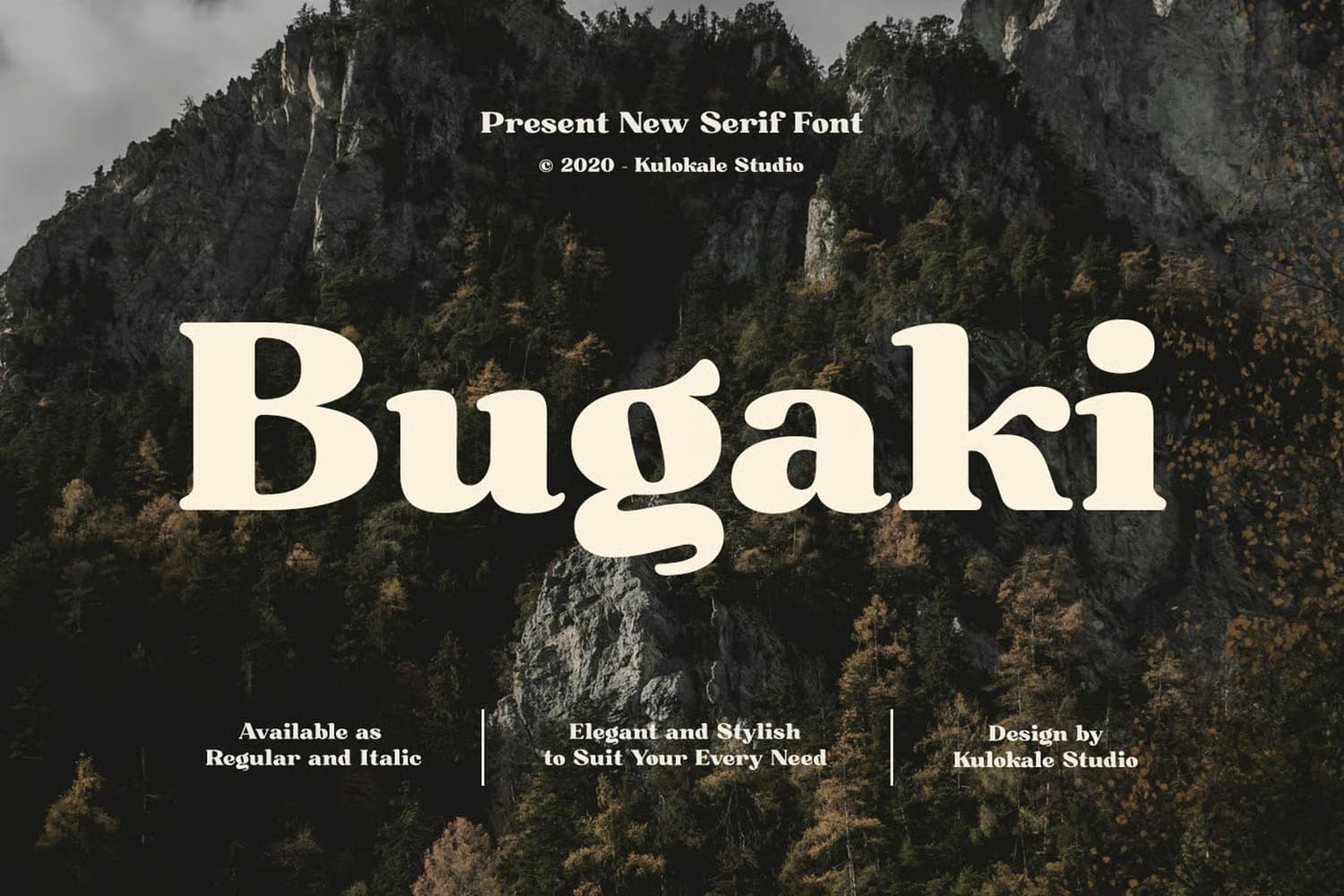
Now that we’ve explored the main types of serif fonts, it’s time to appreciate the rule-breakers, the typefaces that don’t quite fit into any one category but still borrow inspiration from classic serif design. These are the fonts that bend the rules beautifully, blending tradition with creative experimentation.
Take this decorative display serif, for example. It has the defining serif details, but with a twist, ornamental shapes, dramatic curves, and expressive flourishes that make it feel almost magical.
These creative outliers often live in branding, editorial spreads, or poster design, where personality and storytelling matter most.
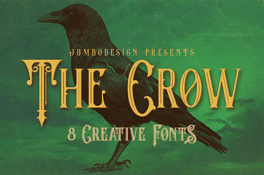
This decorative display serif font proves that typography doesn’t have to follow strict definitions to be effective. Sometimes, it’s the unexpected mix of style and character that makes a design truly stand out.
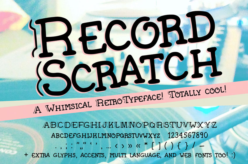
1. Hairline serif
The term hairline serif refers to the thickness of the serif itself. In this case, “hairline” means extremely thin, often just a delicate finishing stroke at the end of a letterform. These fine details give the typeface a light, elegant feel.
You’ll most commonly see hairline serifs in fonts inspired by the Didone classification. Because Didone typefaces are known for their dramatic contrast, the thin serifs work alongside thick vertical strokes to create a refined, high-fashion aesthetic.
Take this example below. The serifs are subtle and precise, but they play a crucial role in shaping the font’s overall personality, adding sophistication without overpowering the letterforms.
2. Wedge serif
Wedge serifs are pretty much what they sound like. Instead of ending abruptly or staying uniform, the serif tapers into a wedge-like shape, gradually narrowing as it extends from the letterform. This creates a sharp, sculpted look that feels both elegant and intentional.
The example below shows an exaggerated wedge serif, where the serifs almost resemble small triangles. Not all wedge serifs are this dramatic, but keeping that taper in mind makes them easier to spot.
They’re especially common in high-contrast typefaces, where the sharp serifs enhance the font’s refined, editorial feel.
This ultra-high-contrast serif font is a strong example of wedge serifs in action, combining crisp edges with a striking sense of sophistication, ideal for fashion layouts, luxury branding, or statement typography.
3. Condensed serif font
You may also see the term condensed used when describing serif fonts, but it’s worth noting that condensed isn’t exclusive to serifs. It can apply to any typeface, serif or sans serif, that’s designed with narrower letterforms and increased height.
In a condensed serif font, this reduced width becomes a defining visual feature. The letters feel taller, tighter, and more vertical, which makes these fonts especially useful when space is limited or when you want to create a strong, dramatic presence, think headlines, posters, or editorial layouts.
Take a look at the example below. Its slim proportions and extended height give it a distinctive rhythm, proving that condensed fonts aren’t just practical, they can be highly expressive too.
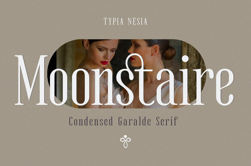
This condensed serif font uses reduced width and added height to create a bold, space-efficient design, perfect for eye-catching typography that still feels refined.
4. Rounded serif font
Let’s also take a look at rounded serif fonts, a style that instantly adds warmth and personality. As the name suggests, the defining feature is the rounded edge of the serif, which softens the letterforms and gives the typeface a more playful, approachable feel.
You’ll often see rounded serifs associated with retro-inspired designs, especially those drawing from the 1960s and 1970s. That era embraced bold shapes, friendly curves, and expressive typography, and rounded serifs fit right in.
In the example below, the serifs are clearly present, but instead of sharp or tapered ends, they finish with smooth, curved edges. That single detail has a big impact on the overall aesthetic, shifting the mood from formal to fun, nostalgic, or even whimsical.
This rounded serif font features soft, curved serifs that give it a distinctive personality, making it a great choice for branding, posters, packaging, or any design that wants to feel inviting and full of character.
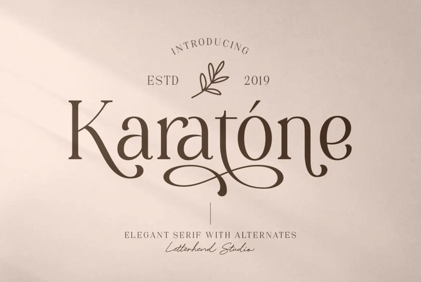
5. Mixed and modern serif fonts
As mentioned earlier, fonts don’t have to fit neatly into predefined categories, especially in modern type design. Today’s designers regularly blend influences, combine contrasting traits, and experiment with form.
In fact, when a particular look gains momentum, it can even spark an entirely new typographic trend.
This is where mixed and modern serif fonts shine. They still qualify as serif typefaces, thanks to their visible serifs, but those details may be subtle, unconventional, or combined with elements borrowed from other styles.
You might see clean, sans-serif-like proportions paired with expressive serifs, or classic structures reimagined with bold, contemporary twists.
Take the example below. It doesn’t fit neatly into just one category, yet its serifs play a crucial role in shaping the font’s identity. The result is a typeface that feels fresh, versatile, and visually engaging, perfect for modern branding, editorial design, or digital-first projects.
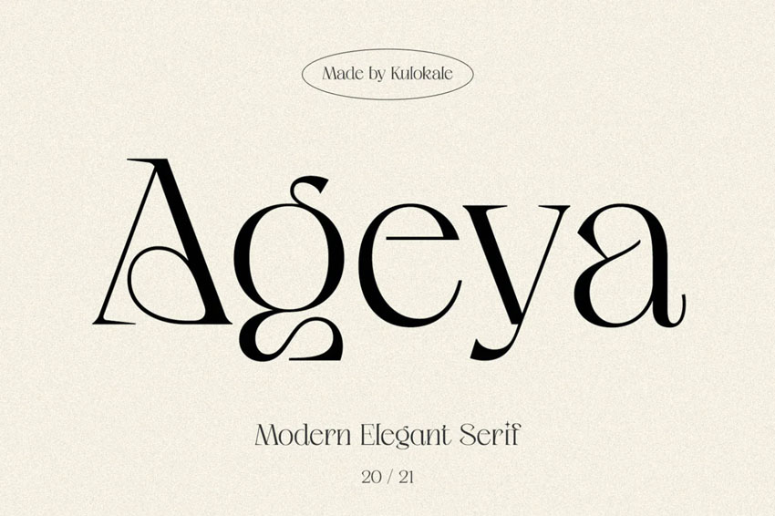
This modern serif font blends multiple design influences, proving that understanding the rules of typography makes it easier and more effective to break them.
Handwriting fonts can also include serifs, and when they do, the results can be wonderfully unexpected. These typefaces blend the organic flow of hand-drawn lettering with structured serif details, creating designs that feel expressive, playful, and full of personality.
Take this example. It’s clearly a handwritten-style font, but notice the chunky, decorative serifs anchoring each letter. Those details add weight and visual interest, even though the font doesn’t fit neatly into traditional serif categories. Instead, it lives firmly in the realm of decorative display typography.
This handwritten serif font combines fun, illustrative elements with bold serifs, making it a great choice for posters, packaging, branding, or any project that benefits from a more human, character-driven look.
On the other hand, some fonts blend influences across multiple categories, and that’s where things get especially interesting.
Take a look at this elegant serif font. With its sweeping curves and graceful swirls, it feels almost as if classic calligraphy and serif typography have been thoughtfully combined.
The result is a typeface that balances structure with fluidity. While the serifs ground the design, the calligraphic flourishes add movement, softness, and visual drama. It doesn’t fit neatly into a single classification, and that’s exactly what makes it compelling.
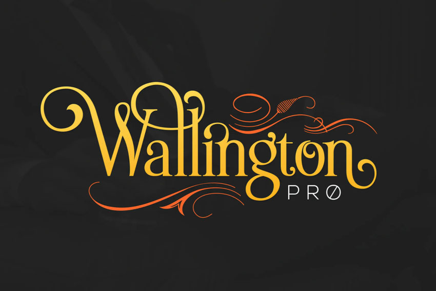
This modern serif font incorporates swirling, calligraphic elements, making it a beautiful choice for editorial layouts, invitations, luxury branding, or any project that calls for elegance with a creative edge.
Serifs don’t have to follow strict rules, and sometimes, breaking them is where the magic happens. Take this nautical-inspired example. Instead of sharp or tapered ends, the serifs wave and curve, instantly evoking the motion of the sea.
There’s even a hint of retro tattoo art in the styling, giving the typeface a bold, illustrative personality.
Despite its decorative flair, it’s still very much a serif font. Those stylized endings remain an essential part of each letterform, proving that serifs can be both functional and expressive.
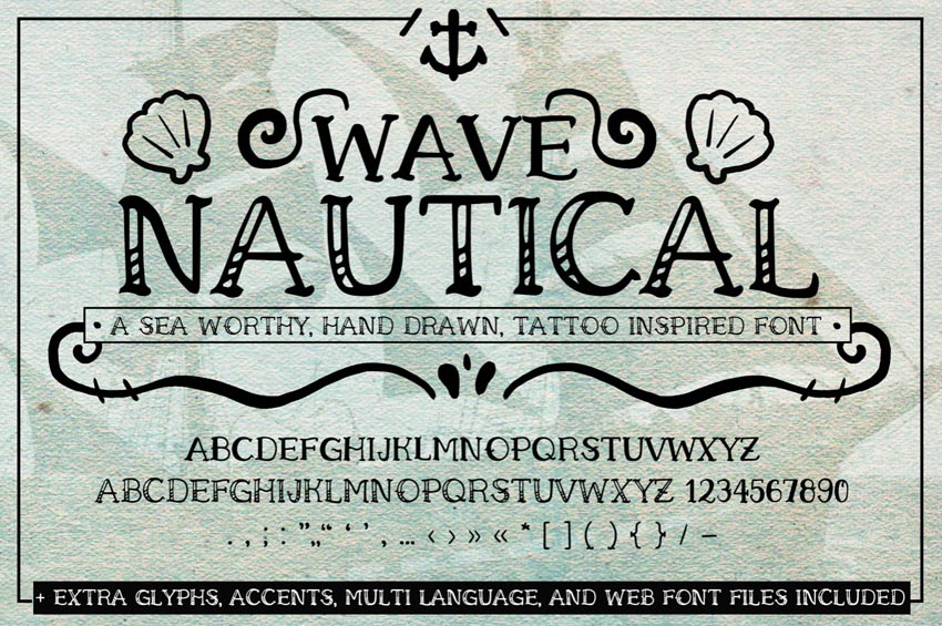
This nautical serif font uses decorative, wave-like serifs to reinforce its sea-inspired theme, making it a standout choice for posters, branding, packaging, or any design that calls for character and storytelling.
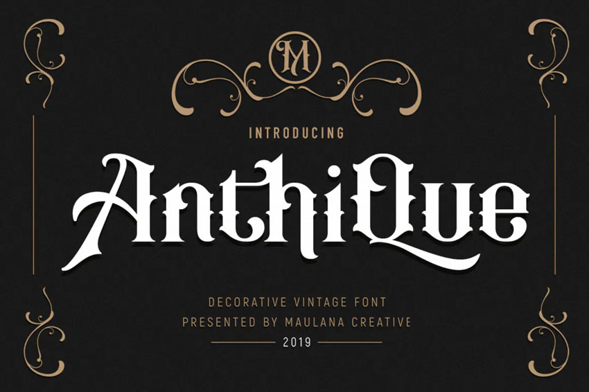
Here’s another example that draws from multiple typographic traditions. This vintage serif font draws on Blackletter design, lending it an ornate, old-world character full of intricate details. The letterforms feel expressive and decorative, almost handcrafted, which adds to their historical charm.
Look a little closer, though, and you’ll spot the serifs themselves, subtly shaped with a slight wedge-like taper. That detail grounds the font in serif territory, even as it borrows stylistic flourishes from elsewhere.
More inspiring serif font examples
By now, it’s probably clear just how diverse and expressive serif fonts can be. From classic and elegant to bold, decorative, and experimental, there’s no shortage of styles to explore.
Which serif aesthetics speak to you most: timeless tradition, modern minimalism, or something delightfully unexpected?
If typography is your thing, it’s worth exploring Envato. With a single subscription, you get unlimited access to thousands of professionally designed fonts, all ready for commercial use. It’s an easy way to experiment, refine your style, and find the perfect serif font for every project, without limits.
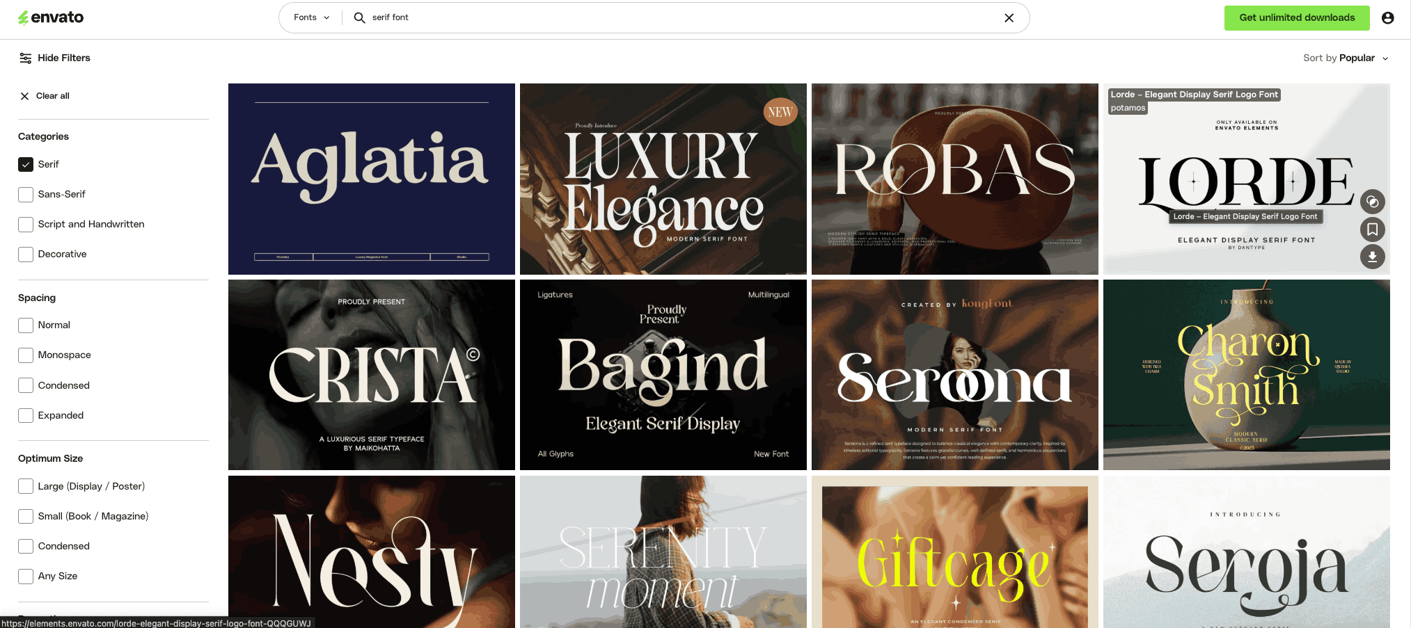
Take a look at this curated sample of some of the best serif fonts in the Envato library. Whether you’re drawn to bold, confident serifs, elegant, editorial styles, or a quirky handwritten serif with personality, there’s something here for every creative direction.
Enjoy the inspiration, explore the details, and feel free to download the fonts that speak to your next project.
1. Fulgate thin serif font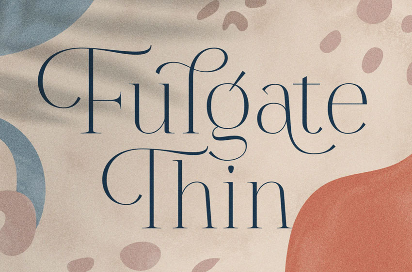
Fulgate is a refined thin serif font with a light, elegant presence that feels modern and intentional. One of its standout features is the selective use of serifs;, some letterforms include delicate finishing strokes, while others remain clean and minimal. This subtle contrast adds visual interest without overwhelming the design.
Because of its slender weight and graceful structure, Fulgate works best in larger display settings, such as headlines, editorial layouts, or sophisticated branding. It’s an excellent choice when you want typography that feels understated, stylish, and quietly confident.
2. Calfine bold wedge serif font
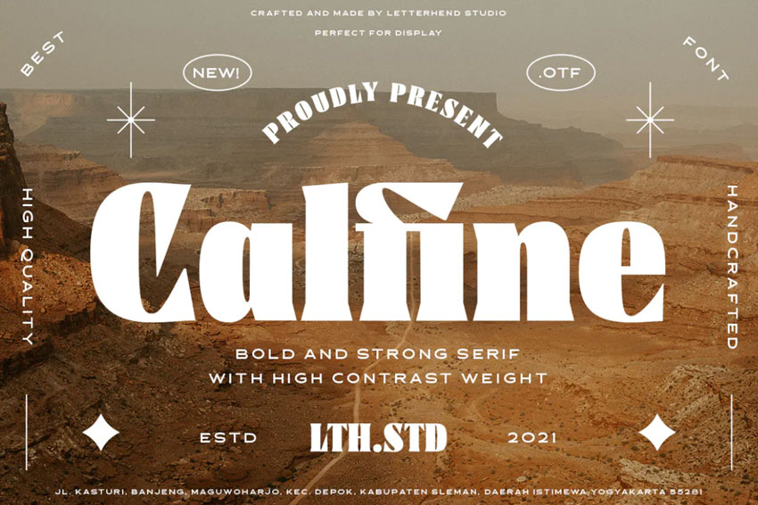
Calfine is a bold, wedge serif font designed to stand out. With its chunky letterforms and strong, tapered serifs, it delivers a highly graphic look that’s hard to ignore. This is the kind of typeface that immediately commands attention.
Its confident weight and sculpted details make Calfine ideal for display use, think posters, logos, packaging, or striking editorial headlines. If you’re looking for a serif font that makes a memorable visual statement, this one brings plenty of personality and impact to the table.
3. Tizart handwriting serif font
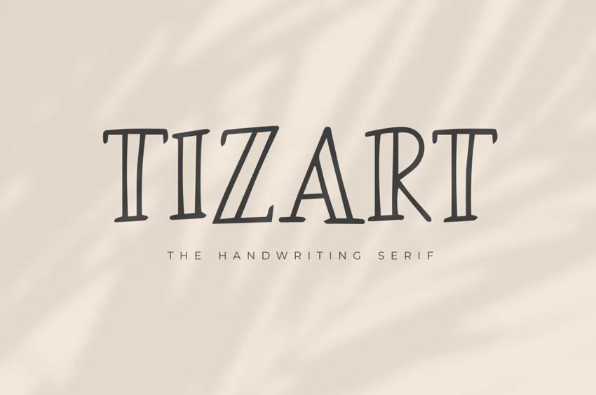
Tizart is a handwriting-style font that brings a relaxed, human touch, while still incorporating serif details. Unlike wedge or tapered serifs, the strokes here maintain a consistent line width, giving the font a cohesive, balanced feel.
The handwritten structure softens the overall look, making Tizart feel welcoming and informal, yet the added serifs give it a sense of structure that elevates it beyond a typical script or casual font.
It’s a great option for branding, packaging, quotes, or creative projects that need warmth without losing clarity.
4. Phoenix Ayash Bold Serif Font
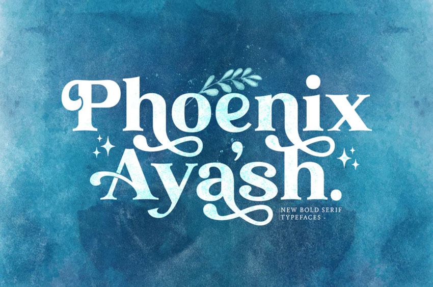
Phoenix Ayash is a bold serif font with undeniable charm. Its sweeping curves, twists, and decorative details give it a magical, almost storybook-like quality, full of character and visual flair. This is the kind of typeface that feels expressive from the very first letter.
Despite its ornate design, Phoenix Ayash remains readable and balanced, making it a strong choice for display typography. Try it in headlines, branding, posters, or creative projects where you want your words to feel dramatic, playful, and full of personality.
Download it and experiment with your own text to see the magic unfold.
5. Howli Playful Serif Font
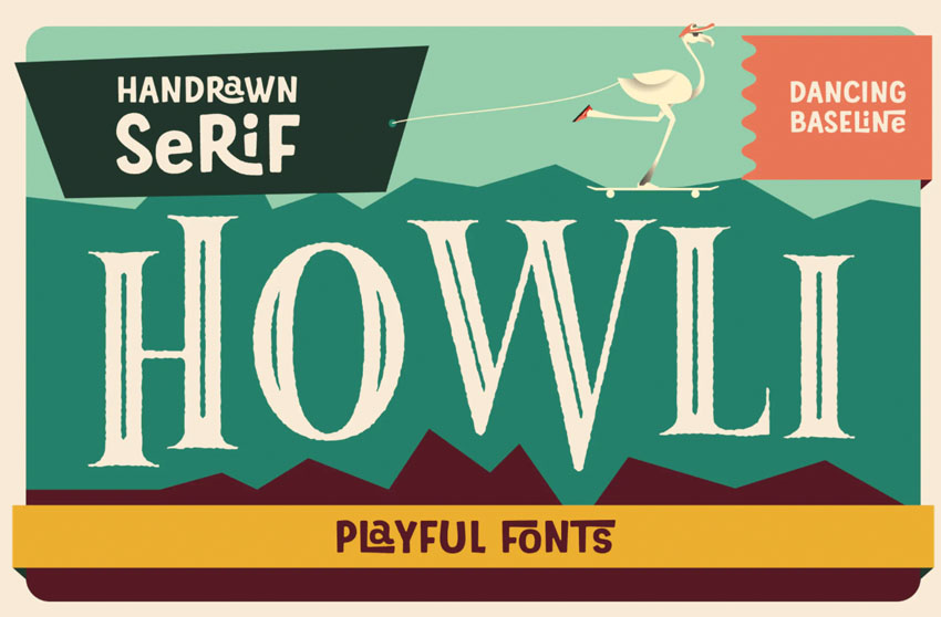
Howli is a playful serif font with loads of personality. Its variable baseline creates a bouncy, whimsical rhythm that instantly feels fun and expressive. That subtle up-and-down movement gives the letters a hand-crafted energy that stands out at a glance.
Look a little closer, and you’ll spot the serifs themselves, soft, rounded details that reinforce the font’s friendly, approachable vibe. Howli really shines when you experiment with it, so try pairing it with bold colors, textures, or layered effects for eye-catching headlines, posters, or creative branding projects.
Which are your favorite serif fonts?
So, which serif fonts stand out to you most? With so many incredible styles available, building a diverse serif font collection is one of the smartest moves you can make as a designer. From polished, professional layouts to playful, informal projects, serif fonts can adapt to almost any creative role.
If you’re on the hunt for fresh typography, Envato is a great place to start. With one simple subscription, you get unlimited access to thousands of fonts, including every kind of serif, from classic and elegant to bold, decorative, and experimental. It’s an easy way to discover new favorites and keep your designs feeling fresh.
And if you’re craving even more inspiration, be sure to explore other font collections on Envato Tuts+. There’s always something new to spark your next idea.
-
 40 Most Popular Fonts of 2021
-
 20 Best Wedding Fonts for Invitations, Signs, and More
 -
 16 Fonts Similar to Georgia
-
 20 Best Art Nouveau Fonts (Stylish Fonts to Download)
 -
 Fonts Similar to Trajan You Can Use in Your Designs
-
 How to Add Fonts to Photoshop (Mac and Windows)
-
 The Ultimate Guide to Typography Basics
Types of serif fonts FAQs
What is the main difference between serif and sans-serif fonts?
What is the main difference between serif and sans-serif fonts?
Serif fonts have small strokes (serifs) at the ends of each letter, while sans serif fonts don’t. Serifs create a traditional, printed feel and are considered more readable in long text, while sans serifs offer a clean, modern look ideal for screens.
Which serif font types are best for body text?
Which serif font types are best for body text?
Old Style and Transitional serif fonts (like Garamond or Times New Roman) are ideal for paragraphs and books because their moderate contrast and warm shapes make reading comfortable at smaller sizes.
Where are Didone serif fonts commonly used?
Where are Didone serif fonts commonly used?
Didones (like Bodoni or Didot) are popular in fashion, luxury branding, and editorial design for their high contrast and elegant, dramatic forms.
What’s the difference between Slab Serif and Old Style fonts?
What’s the difference between Slab Serif and Old Style fonts?
Slab Serifs are blockier and more geometric, with little contrast, giving a bold, modern look. Old Styles, in contrast, have soft, hand-drawn curves inspired by Renaissance calligraphy.
Can serif fonts be used in digital design?
Can serif fonts be used in digital design?
Yes, modern serif fonts with clean structures and balanced proportions perform well on screens, especially for headings or branding where elegance and personality matter.