TL;DR: The IKEA logo uses a custom typeface called IKEA Sans, designed by Robin Nicholas. It’s based on an extra-bold version of Futura, with subtle refinements for legibility and brand distinction. While the original IKEA Sans isn’t publicly available, several close font alternatives on Envato, such as Nofex, Danson, and Vaulto, capture the same bold, geometric style that defines IKEA’s iconic logo.
Few brands have mastered the balance of design and accessibility quite like IKEA. Known around the world for its cleverly crafted, affordable furniture and home essentials, the Swedish giant has built an identity that’s instantly recognizable.
You’ve seen it everywhere, the bold, blue-and-yellow IKEA logo that feels just as familiar as the furniture it represents. But what makes that typography so unmistakably IKEA?
In this article, we’ll take a closer look at the IKEA logo font, its history and color palette, and explore the best IKEA Sans alternatives you can download from Envato to capture the same confident, geometric style.
What is the IKEA font?
Let’s start by answering the big question: What font does IKEA use?
The IKEA logo typography is based on the custom typeface IKEA Sans, designed by Robin Nicholas. According to the IKEA website, the logo draws from an extra-bold version of the Futura typeface, with small, refined serifs added to improve clarity and legibility.
IKEA logo history
Did you know the original IKEA logo from 1951 was red? Founder Ingvar Kamprad chose the color because he believed it symbolized low prices.
Aside from a brief experiment with brown in 1954 and a short return to red in 1981, the IKEA logo has stayed largely consistent over the decades. Its now-familiar blue and yellow color scheme reflects the brand’s Swedish roots, with only minor refinements along the way. Below, you can see a visual timeline of the IKEA logo’s evolution.
IKEA logo timeline
- 1951 — The original red logo A simple wordmark in bold red, chosen to represent affordability and passion.
- 1954 — The brown era IKEA briefly switched to a brown logo, aiming for a warmer, more traditional look, but it didn’t last long.
- 1967 — The birth of the oval The brand introduced the oval shape and bold serif lettering, defining elements that still anchor the logo today.
- 1981 — Return to red A short-lived revival of the red color, echoing the brand’s early identity.
- 1983 — The blue and yellow transformation IKEA adopted the now-iconic blue and yellow color palette, inspired by the Swedish flag. This version became synonymous with the brand worldwide.
- 2019 — Subtle refinement The logo was modernized with cleaner typography and balanced proportions, staying true to its heritage while adapting for digital use.
The IKEA color palette
We all recognize the iconic IKEA color palette, blue and yellow, but if you’re looking to match those shades with precision in your own designs, you’ll need the exact values. Below are the official IKEA color codes, as listed by the Brand Color Code website:
| IKEA Blue | IKEA Yellow | |
|---|---|---|
| Hex Code | #0057AD | #FBDA0C |
| RGB | 0, 87, 173 | 251, 218, 12 |
| CMYK | 100, 50, 0, 32 | 0, 13, 95, 2 |
| Pantone | 2145 C | 108 C |
Why the typography works so well
IKEA’s typography succeeds because it perfectly matches the brand’s personality, simple, functional, and universally approachable. Just like its flat-pack furniture, the type design is built for clarity and efficiency. Every curve and letterform feels intentional, communicating reliability without ever trying too hard.
The logo uses a custom serif typeface inspired by Futura, striking a balance between warmth and structure. The bold, geometric shapes make it instantly legible from a distance, whether printed on packaging, storefronts, or digital screens. That’s no accident: IKEA’s visual identity was designed to scale seamlessly across mediums, reflecting its “for everyone” philosophy.
The typography also mirrors Scandinavian design values such as clean lines, minimal ornamentation, and an emphasis on practicality. There’s a quiet confidence in its simplicity, echoing the same design principles that define IKEA’s products.
In short, IKEA’s type works because it doesn’t just spell out the brand name; it embodies the brand’s promise: accessible design, built with care, for everyday life.
IKEA logo font alternatives
The IKEA Sans typeface is a proprietary design, meaning it’s not available for public use. The good news? You can still get the same clean, modern feel with a few excellent lookalikes on Envato.
If you’re after a font inspired by the IKEA logo or something that channels the timeless geometry of Futura, these 10 alternatives are a perfect place to start.
1. Nofex Expanded Sans Serif (OTF, TTF, WOFF)
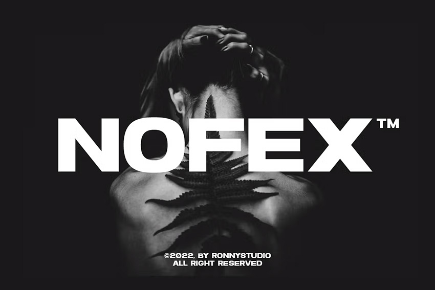
Nofex is a bold, modern take that echoes the strength and simplicity of the IKEA font. Its wide letterforms and crisp geometry give it that same confident, contemporary feel, perfect for logos, signage, or bold headlines. The all-caps design offers excellent legibility, while built-in ligatures and alternates add extra flexibility for custom branding work.
2. Quart Headline Typeface (OTF, TTF, EOT, SVG, WOFF)
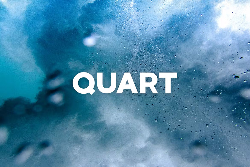
Quart is a bold display typeface that channels the same confident energy as the IKEA font. With both regular and outline versions included, it gives you room to experiment, whether you’re crafting standout logos, clean branding, or striking editorial titles. Its geometric balance and strong presence make it a versatile choice for any modern design project.
3. Danson Sans Serif Font Family (OTF)
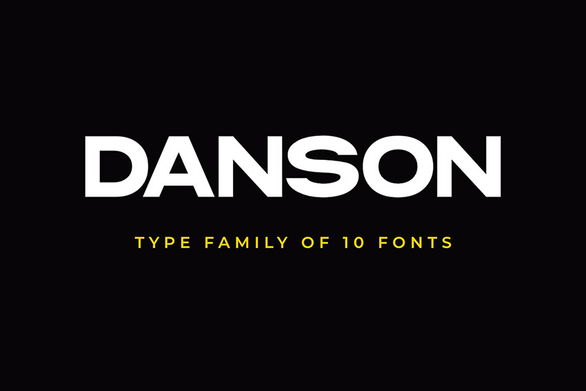
Danson is a clean and adaptable sans-serif font family that fits beautifully in place of the IKEA font. With ten styles included, it gives you plenty of range to mix and match. Danson Bold is the closest match to the IKEA logo’s strong, modern look, while the lighter weights offer a perfect balance for subheadings, taglines, or minimal layouts.
4. Vaulto Extended Bold Sans Serif (OTF, TTF, WOFF)
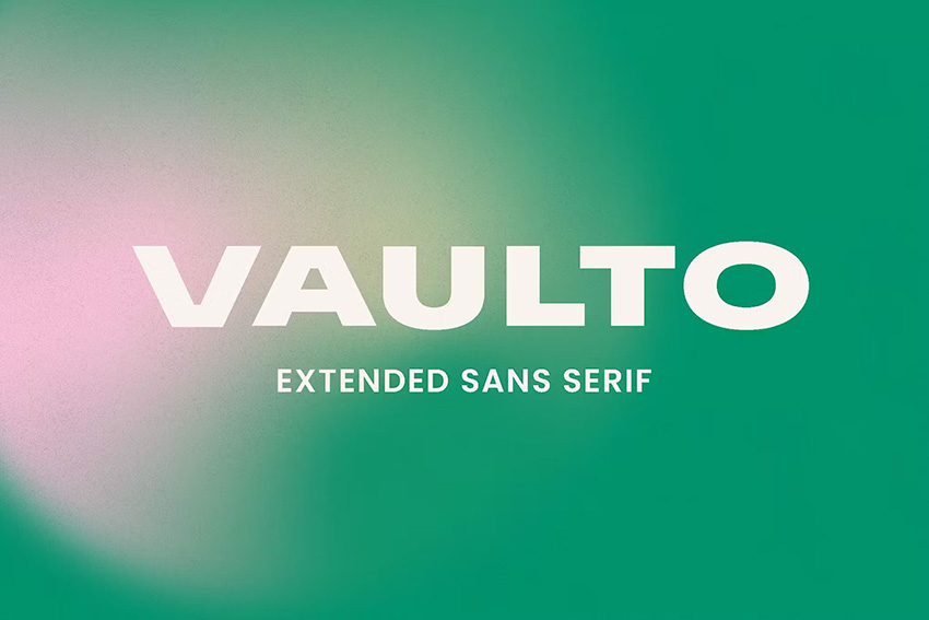
Vaulto brings a powerful, stretched aesthetic that captures the same bold personality as the IKEA logo. Its extended letterforms and solid weight make every word stand out with confidence and clarity. Perfect for logo design, editorial layouts, or striking web headers, Vaulto delivers that modern, Scandinavian-inspired edge with professional polish.
5. Vancouver Gothic (OTF, TTF, EOT, WOFF)

Vancouver Gothic takes a slightly different route from the IKEA font, with more condensed letterforms and a sleek, modern feel. What it shares, though, is that same minimalist confidence and bold visual punch. It’s clean, versatile, and works beautifully for branding, packaging, or any project that calls for a simple yet striking sans serif.
6. Next Sphere (OTF)
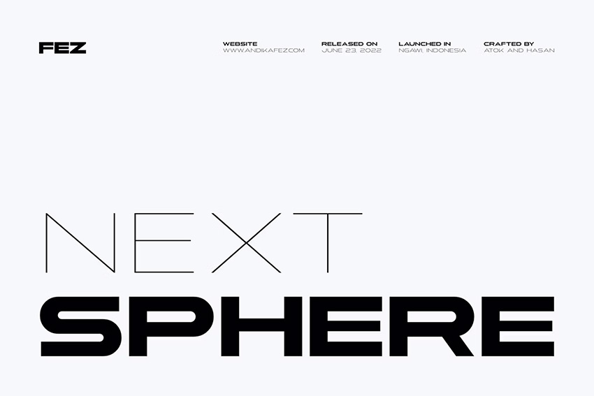
Next Sphere takes the IKEA font’s geometric simplicity and stretches it into the future, literally. Its extended letterforms and sleek proportions create a bold, forward-looking aesthetic that’s perfect for tech-inspired branding, modern logos, or minimalist poster design. It’s not an exact match, but it’s a creative twist with plenty of visual impact.
7. Visage Bold & Regular (OTF, TTF, WOFF)
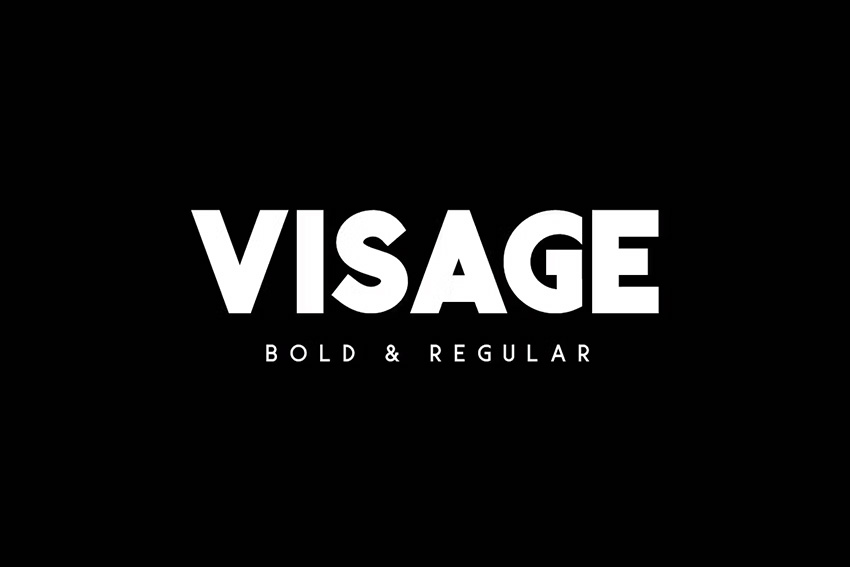
Visage is a clean, contemporary sans serif that offers both bold and regular styles, making it easy to build cohesive logo systems. Use the bold version to capture the strong, minimalist feel of the IKEA font, and the regular weight for supporting taglines or subheadings. It includes uppercase multilingual letters, numbers, and punctuation, ideal for versatile branding projects.
8. Sovereign Typeface (OTF, TTF)
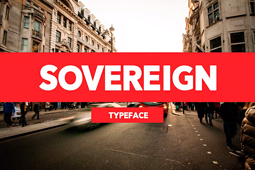
Sovereign Typeface delivers the same confident, modern aesthetic that makes the IKEA logo so recognizable. Its bold shapes and clean geometry give designs a polished, high-impact look, perfect for logos, T-shirts, web banners, and bold brand statements. It’s a versatile choice when you want your typography to stand tall and make an impression.
9. Conigen Modern Sans Serif (OTF, TTF, WOFF)
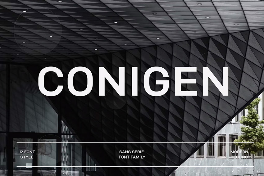
Conigen is a modern sans serif with twelve distinct styles, giving you endless flexibility to mix and match. The Black version comes closest to the bold, chunky look of the IKEA font, while the lighter weights work beautifully for contrast in supporting text. It’s a versatile family that balances strength with sophistication, great for logos, editorial layouts, and digital branding.
10. Frank (OTF, TTF, WOFF, WOFF2, EOF)
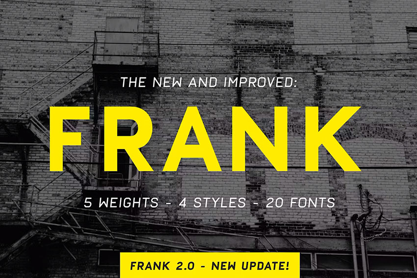
Frank blends modern precision with classic inspiration, drawing from type legends like DIN, Eurostile, and especially Futura, the same geometric DNA that gives the IKEA logo its clean, confident style. With over 300 glyphs and five weights across normal, oblique, and rough versions, Frank gives you the freedom to experiment with texture, tone, and impact across any design project.
Other fonts similar to the IKEA logo
If you love the clean, modern geometry of the IKEA font, you’ll find plenty of inspiration in these timeless sans serifs. Each one offers its own spin on simplicity, structure, and legibility; perfect for logos, branding, and digital design.
- Avenir: Designed by Adrian Frutiger, Avenir is a geometric sans serif that balances warmth with precision. With weights from light to heavy, it’s a go-to for everything from logos to digital interfaces.
- Gill Sans: Created by Eric Gill, this humanist sans serif blends classic charm with strong readability. Its variety of styles, from light to ultra-bold, makes it perfect for branding, editorial layouts, and signage.
- Helvetica: A true design icon, Helvetica by Max Miedinger is beloved for its clean neutrality. Its crisp structure adapts beautifully across web, print, and corporate identity projects.
- Univers: Another Adrian Frutiger classic, Univers is a neo-grotesque sans serif with an impressive range of weights and widths. Its uniform shapes and contemporary style make it ideal for editorial design and wayfinding systems.
- Frutiger: A humanist sans serif also by Adrian Frutiger, Frutiger is known for its legibility and warmth. Designed originally for airport signage, it remains a favorite for branding and environmental design today.
Download your favorite IKEA font alternative today
In this roundup, we’ve explored the question “What font does IKEA use?” and shared some of the best lookalike fonts you can start using right now. From bold, geometric sans serifs to sleek modern designs, these options capture the same timeless appeal that’s made IKEA’s branding so iconic.
Ready to take your design further? Browse Envato to discover thousands of professional fonts and creative assets, all available for unlimited download. Whether you’re designing a logo, a web banner, or a full brand identity, you’ll find the perfect typeface to match your vision.
FAQs
What font is used in the IKEA logo?
The IKEA logo uses a custom typeface called IKEA Sans, created by Robin Nicholas. It’s inspired by an extra-bold version of Futura, modified to make the lettering more readable and distinctive.
Is the IKEA Sans font available for download?
No, IKEA Sans is a proprietary font and isn’t publicly available. However, you can find close alternatives such as Nofex, Danson, or Vaulto on Envato that replicate its clean and bold geometric style.
What colors does IKEA use in its logo?
The classic IKEA color palette includes IKEA Blue (#0057AD) and IKEA Yellow (#FBDA0C). These colors are inspired by the Swedish flag, symbolizing the brand’s national pride and vibrant energy.
Why did IKEA choose blue and yellow for its logo?
The blue and yellow color scheme reflects IKEA’s Swedish heritage. Blue stands for trust and reliability, while yellow represents warmth and optimism, values that the brand aims to bring into its customers’ homes.
What fonts are similar to IKEA Sans?
Fonts that share the same clean, modern style include Nofex, Quart, Danson, Vaulto, Vancouver Gothic, Next Sphere, Visage, Sovereign, Conigen, and Frank. Each offers bold geometric forms similar to IKEA Sans, perfect for logos, posters, or editorial design.
Has the IKEA logo changed over time?
Yes, but not drastically. The first IKEA logo in 1951 was red, later shifting through brief color variations before settling on the now-familiar blue and yellow design that debuted in the 1980s.
Feel like learning more about fonts? Try these articles and tutorials next: