
TL;DR: Photoshop no longer includes built-in Pantone libraries, but you still have solid options. In this guide, we break down what changed, how Pantone Connect fits into modern workflows, and which alternative tools are more reliable in 2026, depending on whether you’re working digitally or preparing files for print.
If you’re a graphic designer or someone who works with colors, you’ll still find older tutorials claiming that Photoshop includes built-in Pantone libraries. However, if you’re using the 2025 or 2026 versions, you’ve probably noticed those options are gone.
Before jumping into the available workarounds to match Pantone colors, it’s worth answering a few key questions.
Do designers still use Pantone colors in 2026?
Even though many projects are now fully digital, Pantone still plays a key role whenever color accuracy really matters. High-stakes branding, brand guidelines, and physical printing all rely on a shared color language, and Pantone remains the industry standard for that job.
For many designers, the thought process looks something like this:
- You find a color in Photoshop and think, “I love this shade.”
- Almost immediately, the next question follows: “What’s the Pantone equivalent?”
That instinct comes from experience. Clients expect consistency across every touchpoint, and many digital-first projects eventually expand into print. To make that possible, designers need to document colors in brand kits and communicate clearly with printers using a system everyone understands.
Does Pantone matter even when colors start digitally?
Yes, absolutely. In real-world workflows, plenty of colors start life as RGB or Hex values. From there, designers look for the closest Pantone match. It’s less about finding a perfect one-to-one conversion and more about translating a color into a reliable, print-ready reference.
☁️Big news: Pantone’s 2026 Color of the Year is Cloud Dancer – the first white ever chosen.Soft, weightless, and quietly radical; it’s color as calm, not chaos. pic.twitter.com/fmoOkrlZPL
— Envato (@envato) December 4, 2025
Is Pantone still relevant for digital and print design?
Short answer: yes. While Pantone is less accessible than it used to be (and that’s a common frustration), the underlying need hasn’t gone away. Designers are still regularly searching for things like:
- “Closest Pantone to this color”
- “Pantone equivalent”
- “What Pantone is this color?”
Because in professional design, a word like “red” doesn’t mean much on its own. Reds can lean warm or cool, orange or blue. When you spot the perfect color in nature or on an object, the goal is always the same: capture it accurately so it looks just as good when it’s printed.
How modern design workflows use color systems
In a digital-first 2026 workflow, the direction often goes the other way. It’s now common to start with a Pantone color name, say, Cloud Dancer, and then look up its Hex value for web or UI work.
Sometimes this starts as curiosity. Other times, it’s a professional requirement for a client brand book or a cross-platform design system. Either way, there are reliable ways to do this without depending on unofficial files or outdated formats, and that’s exactly what we’ll cover next.
Why Pantone colors are no longer built into Photoshop
Until 2022, this workflow was much more straightforward. Finding a Pantone color in Photoshop didn’t require extensions or external tools.
The workflow looked like this:
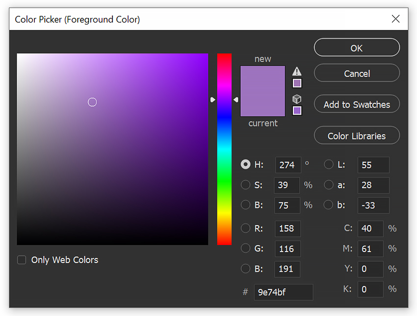
1. Open Photoshop and double-click the Foreground Color swatch to open the Color Picker.2. Click Color Libraries on the right-hand side of the Color Picker window.
3. From the Book dropdown menu, you can choose between three groups of Pantone colors, including:
- Pantone+ CMYK Coated
- Pantone+ CMYK Uncoated
- Pantone+ Metallics Coated
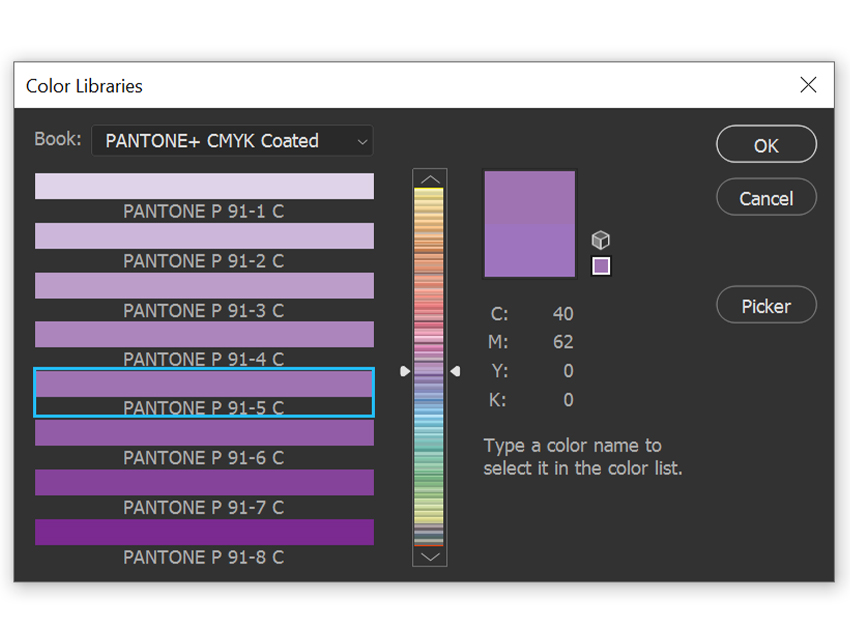
And that was it. Simple, fast, and built directly into your workflow. Unfortunately, that setup isn’t available anymore.
What changed with Pantone support in Adobe Photoshop
The short answer is licensing. Following changes to the licensing agreement between Adobe and Pantone, the standard Solid Coated and Solid Uncoated libraries, the ones most designers rely on, were removed from Photoshop.
As a result, in 2026, the Book dropdown no longer includes Pantone color libraries by default. If you’re opening the Color Picker today and wondering whether you’re missing something, you’re not. The options simply aren’t there anymore.
The good news? While the old built-in method is gone, designers haven’t lost the ability to work accurately with Pantone colors. There are still practical, professional ways to get your colors right without adding unnecessary cost or friction to your workflow, and we’ll walk through those next.
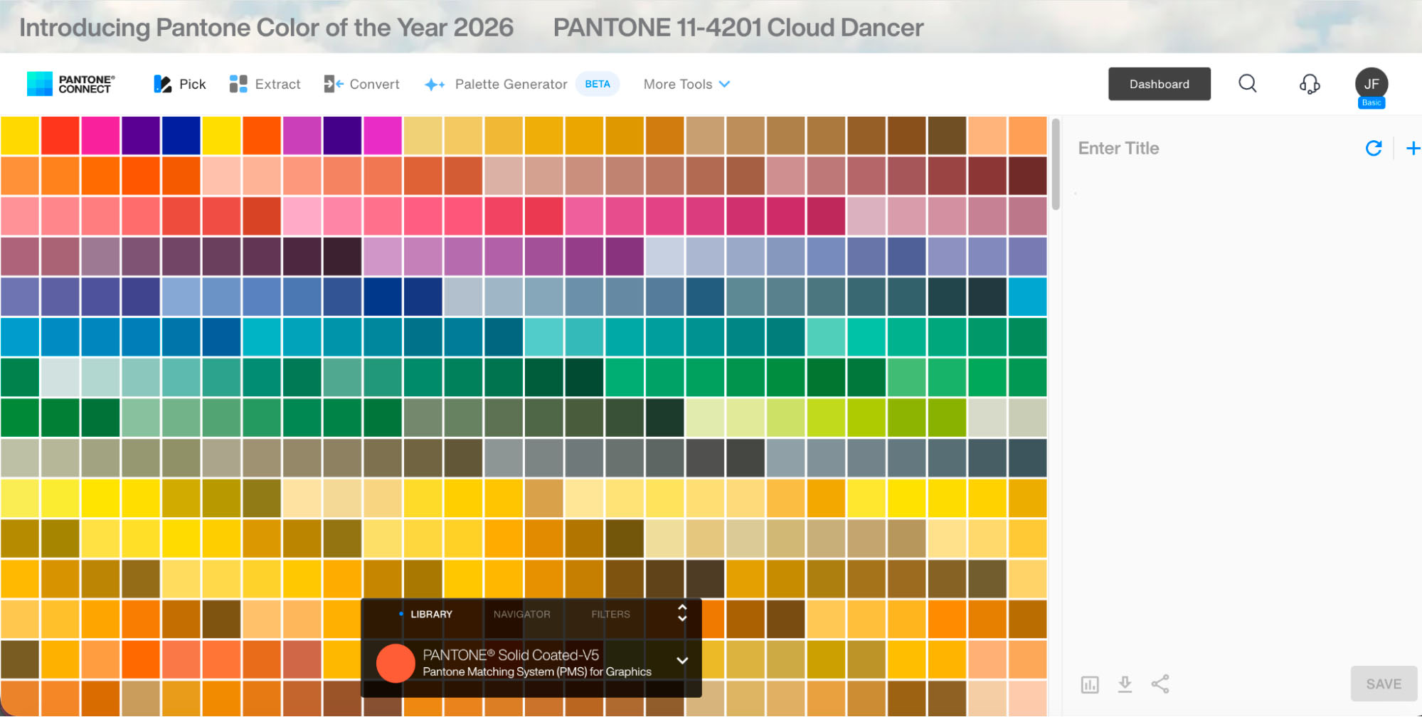
How to find a Pantone color in Photoshop using Pantone Connect
Before we dive in, it’s worth setting expectations.
Note (Jan 2026): At the time of writing, the Pantone Connect extension is experiencing widespread technical issues. Many users report encountering internal server errors, blank panels, or failed launches inside Photoshop. While Pantone Connect is still the only official way to access the full Pantone libraries, its current stability is inconsistent.
If you still want to try it, here’s how the process works.
Step 1: Download Pantone Connect and create an account
Head to Adobe Exchange and search for Pantone Connect. From there, click the Free button to add the extension to your Creative Cloud account.
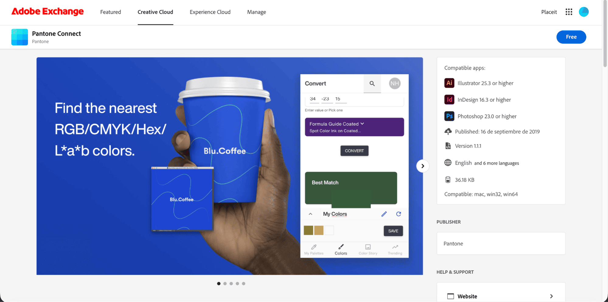
- Before installing, it’s a good idea to close all Adobe applications. This helps avoid sync issues and ensures the extension installs correctly.
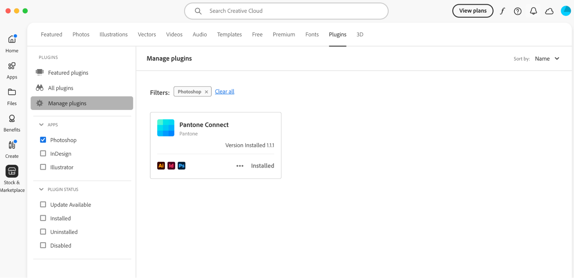
Step 2: Confirm the extension is installed correctly
- Once the extension is added, you should see a confirmation pop-up from Creative Cloud. After that, reopen Photoshop to make the plugin available inside the app.
- At this stage, no manual activation is required; if the installation worked, Photoshop should recognize it automatically.
Step 3: Open Pantone Connect inside Photoshop
In Photoshop’s top menu bar, go to Plugins. If everything is set up correctly, you’ll see Pantone Connect listed there.
One important limitation to be aware of:
As of now, many users report that clicking the plugin either opens a blank panel or redirects them to a web browser rather than loading the color tool directly in Photoshop. When that happens, the extension isn’t usable in a real production workflow.
A quick reality check
Software changes fast. It’s entirely possible that Adobe and Pantone roll out fixes or updates after this article is published. If Pantone Connect becomes stable again, we’ll update this section right away.
Until then, most designers are relying on alternative workflows to find Pantone equivalents without breaking momentum, and those options are often faster, more reliable, and easier to maintain.
Pantone Connect mobile app: an alternative workflow
With Photoshop’s built-in Pantone libraries gone and the desktop extension proving unreliable, many designers have settled on a more dependable workaround: the Pantone Connect mobile app.
While it isn’t a perfect replacement for the old in-app workflow, it’s currently one of the most practical ways to identify Pantone colors accurately. It’s quick to use, accessible on mobile, and, crucially, far more stable than the desktop plugin at the moment.
Note: Pantone Connect also offers a separate web-based interface that works in a desktop browser and mirrors many of the mobile app’s features. This is different from the Pantone Color Finder covered later in this guide. Availability and functionality can vary by account and region, so this section focuses on the mobile app, which is currently the most consistent option.
Step-by-step workflow using the mobile app
Step 1: Install the Pantone Connect mobile app
Install the Pantone Connect app on your mobile device and create a free account to get started. You can explore basic features without committing to a paid plan.
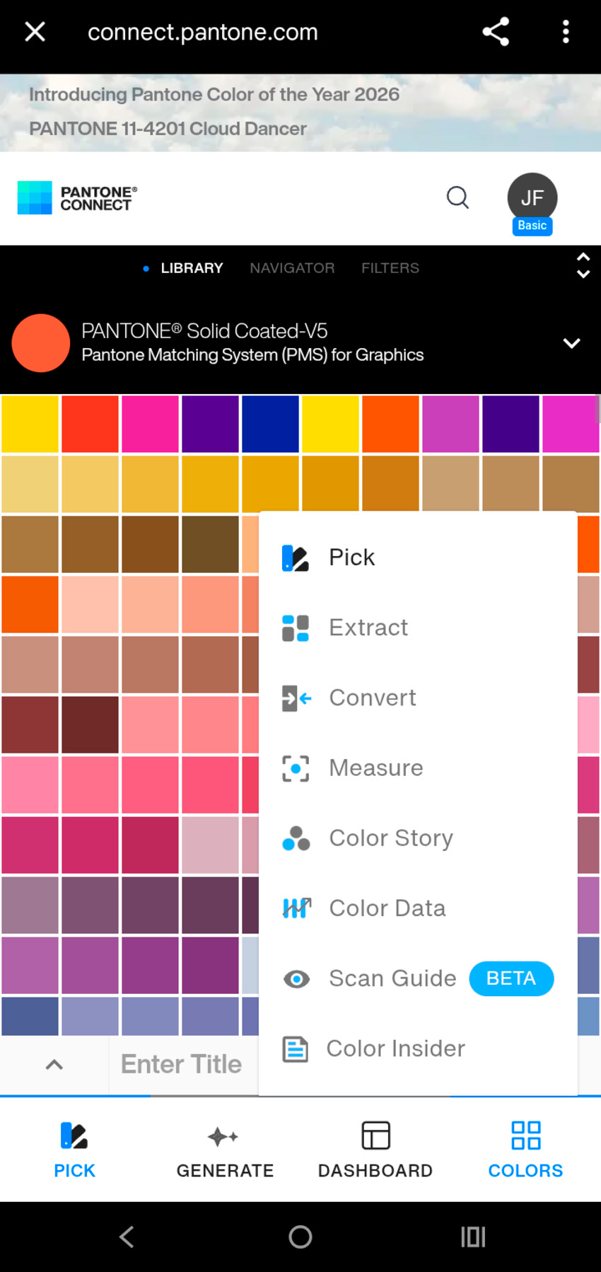
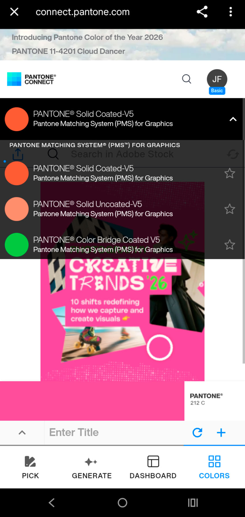
Step 2: Open the Pantone app
Once it’s open, from the bottom navigation, go to Colors, then select Extract. This tool lets you sample colors directly from images. It works similarly to sampling colors in Photoshop, but within the Pantone app.
Step 3: Upload your image
You can search for visual references inside the Adobe Stock library or upload your own image by tapping Add Image.
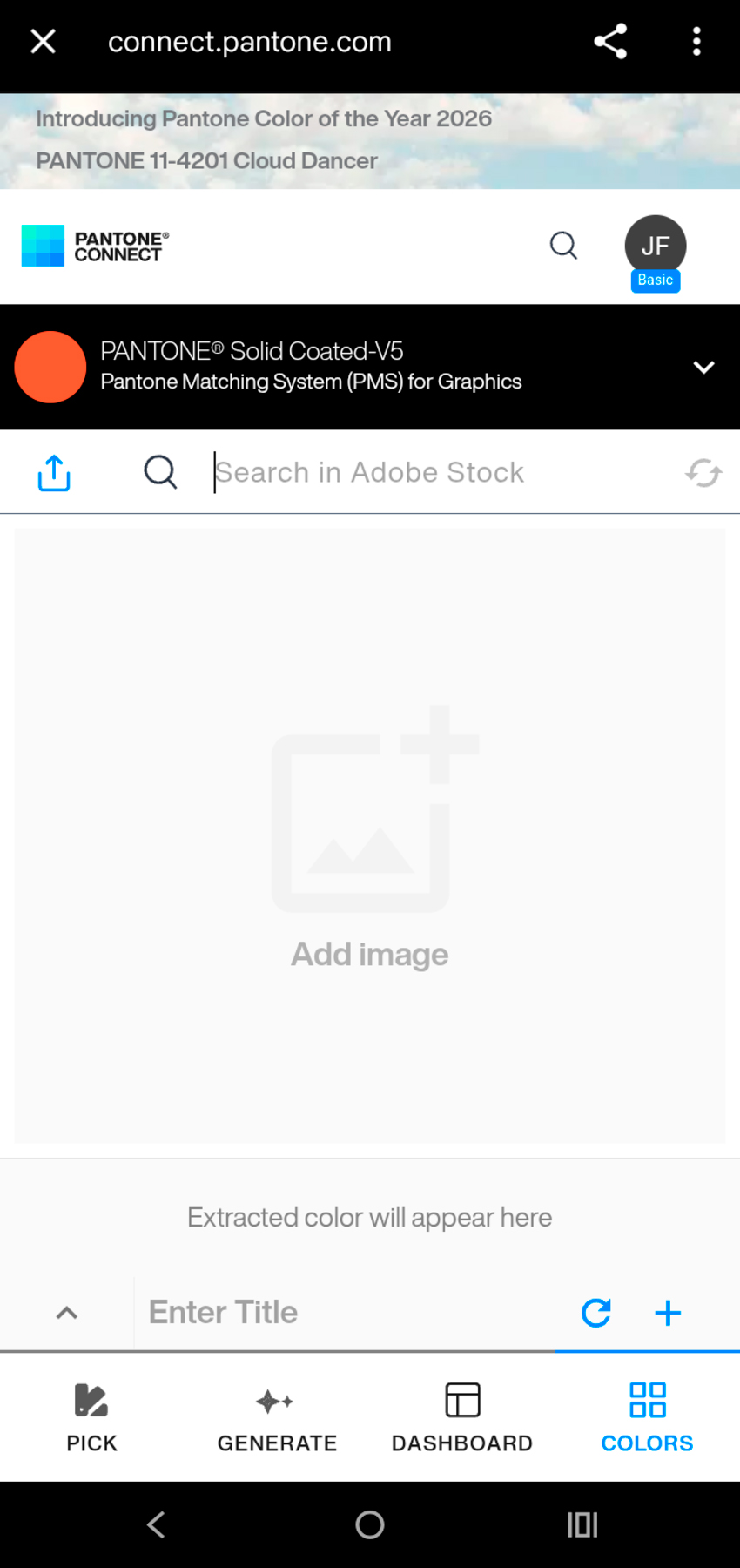
You can upload almost any image: stock photos, mockups, screenshots, or your own artwork — to identify the closest Pantone color.
If you need visual material to test colors, Envato’s AI tools & unlimited creative assets make it easy to generate or download images and use them directly in this step.
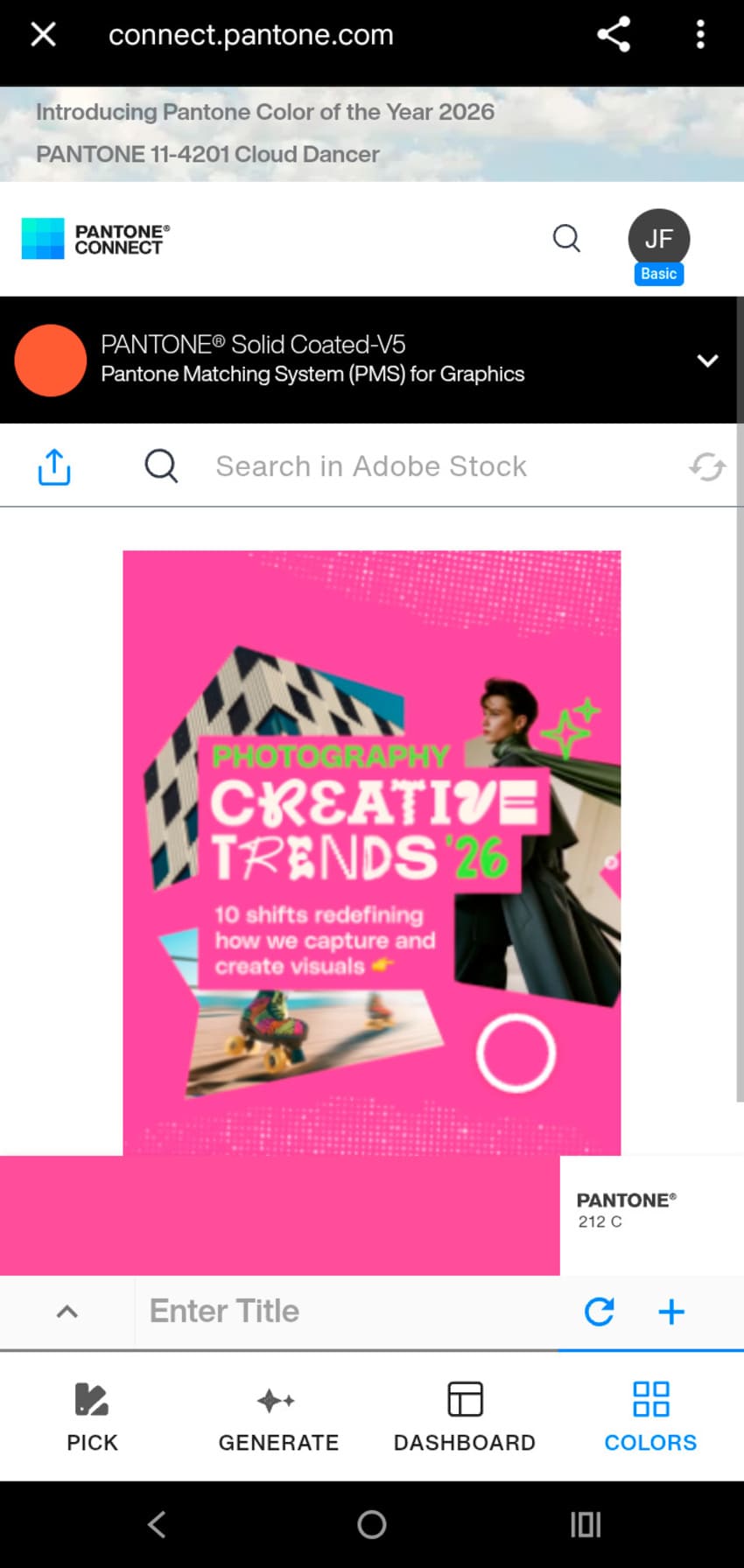
Step 4: Sample the image to find the closest Pantone match
Once your image loads, a circular selector appears. Move it across the image to sample specific areas. As you adjust the selector, the app suggests the closest Pantone matches in real time.
For example, sampling the cover of an Envato Instagram post about photography trends may return a suggestion like Pantone 212 C.
Step 5: Adjust the color library and finish selection
Don’t stop at the first result. You can filter which Pantone libraries the app uses, helping you narrow results to colors that make sense for your final output.
To ensure your colors translate correctly into Photoshop or Illustrator, it’s important to filter by the correct library. Open the library settings and select Pantone Matching System (PMS) for Graphics.
Here’s a quick guide on how to choose the right library:
Avoid TCX codes for graphic design. TCX stands for Textile Cotton Edition and is intended for fabric, not paper. Using a TCX color for logos, posters, or print ads can lead to major color shifts when printed. For graphic design and branding work, stick to Pantone Solid Coated or Solid Uncoated, depending on your paper type.
Instead take a look at the Pantone Matching System (PMS) for graphics:
| Library | What is it for |
|---|---|
| Pantone Solid Coated (C) | Best for glossy or coated paper, such as magazines and premium brochures. Colors appear more vibrant and saturated. |
| Pantone Solid Uncoated (U) |
Designed for matte or porous paper, like letterheads or stationery. colors print softer and more muted. |
| Pantone Color Bridge | Useful for previewing how a Pantone color converts to CMYK for digital printing workflows. |
While this mobile-to-desktop workflow isn’t as direct as selecting a Pantone color inside Photoshop like we could back in 2022, it’s currently one of the most reliable ways to integrate Pantone into professional projects, without dealing with plugins that may be unstable.
How to find a Pantone color using the Pantone Color Finder (web)
In 2026, the Pantone Color Finder web tool became one of the most dependable ways to identify Pantone equivalents. It requires a bit more manual judgement and a trained eye, but it’s fast, free to use, and doesn’t rely on plugins or software installations.
This makes it especially useful when you’re working with digital colors and need a reliable reference for print or brand documentation.
Step 1: Open the official Pantone Color Finder
Start by opening the official Pantone Color Finder in your browser. You’ll see a simple search interface that allows you to enter specific color values.
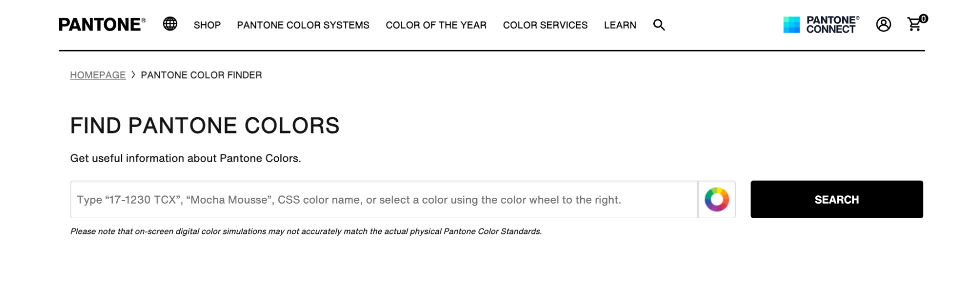
This tool works entirely online, so there’s nothing to install and no Creative Cloud integration to worry about.
Step 2: Enter a Hex or RGB color value
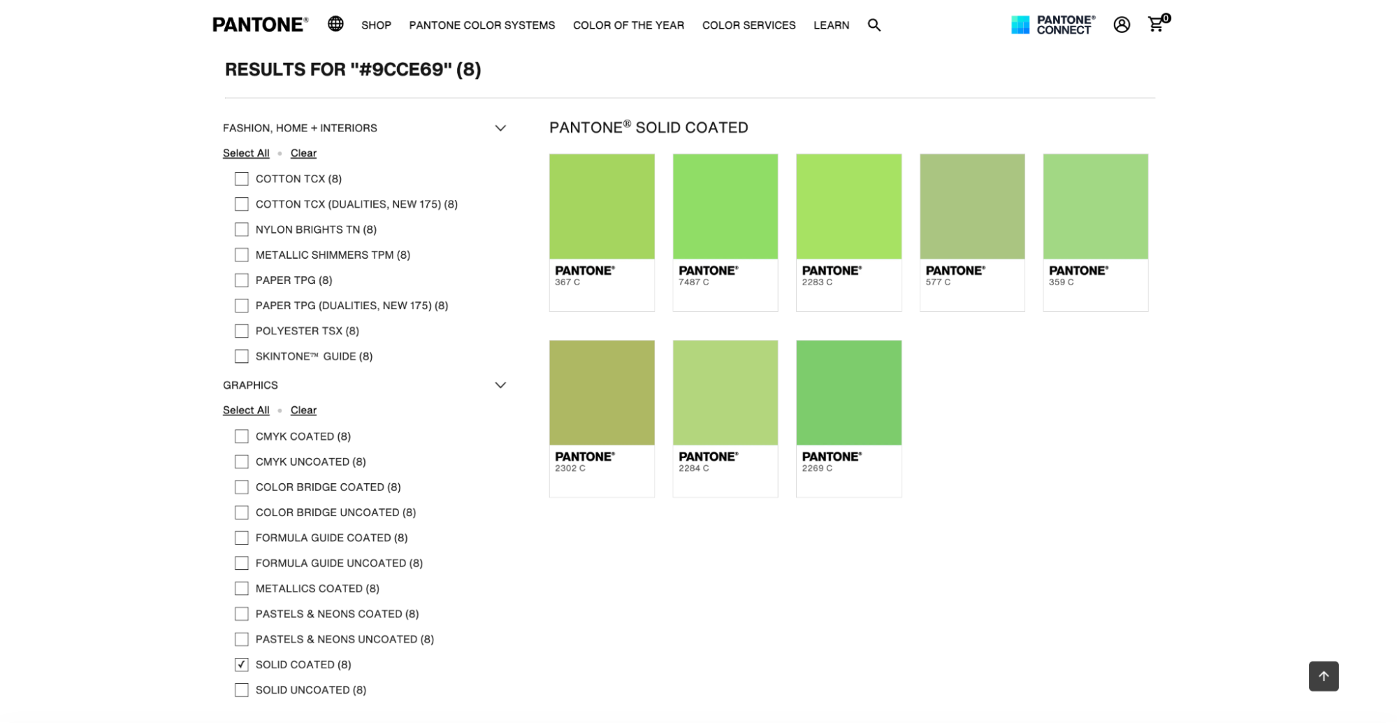
Paste your Hex value into the search bar, for example, a bright green like #9CCE69, and click Search.
This approach is ideal when you’ve spotted a color you like on a website, in a digital mockup, or inside a UI design and want to identify its closest Pantone match.
Step 3: Compare Pantone matches and choose the closest color
The tool returns a list of Pantone colors that closely resemble your Hex value.
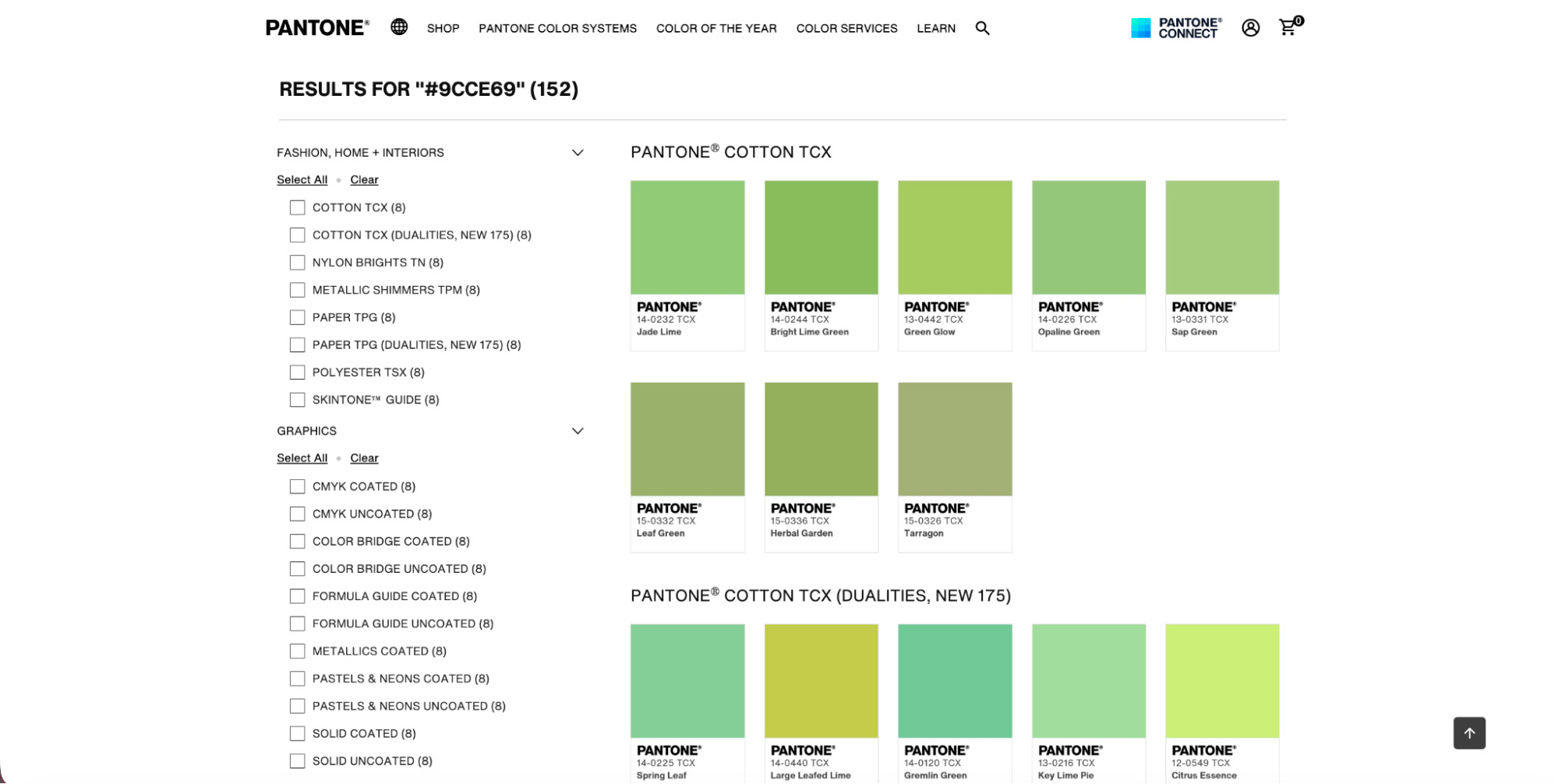
- Best match first: Pantone highlights its suggested closest match at the top of the results.
- Side-by-side comparison: Use the split-color swatches to visually compare your original Hex color with each Pantone option.
Pro tip: Filter the results to Pantone Solid Coated to get the most relevant options for graphic design and print production.
This is the step where experience matters most. Small shifts in warmth or saturation can make a big difference once the color is printed.
Step 4: Apply the Pantone color to your workflow
Once you’ve chosen the closest Pantone match, you can use the Pantone name to build color styles, brand kits, or palettes directly in Photoshop or Illustrator.
From there, it’s easy to maintain consistency across digital layouts, print files, and brand guidelines.
How to choose the right Pantone workflow in 2026
Between these three approaches, the official extension, the mobile app for visual exploration, and the web-based finder for precise matching, you always have a reliable way to work with Pantone colors.
While the changes introduced in 2022 added a few extra steps to the process, they didn’t remove the need for Pantone itself. Instead, they pushed designers toward more flexible workflows that still support accuracy, consistency, and professional handoff.
The key is knowing when to use each method. Use mobile tools to explore and extract inspiration, rely on the web finder when you need precision, and treat plugins as optional rather than essential. With that mindset, working with Pantone in 2026 remains completely manageable, even without the old built-in libraries.
How to find a Pantone color in Photoshop FAQs
Why is Pantone not showing up in Photoshop?
Why is Pantone not showing up in Photoshop?
Pantone no longer appears in Photoshop because Adobe removed the standard libraries after licensing changes in late 2022.
As a result, recent versions of Photoshop no longer include the Solid Coated and Solid Uncoated Pantone books by default. Instead, when you open the “Color Libraries” menu in 2026, you will typically only see alternative color systems from other brands.
How do I find Pantone Connect in Photoshop?
How do I find Pantone Connect in Photoshop?
You can access Pantone Connect in Photoshop from the Plugins menu at the top. After installing the extension from Adobe Exchange, open Photoshop and go to Plugins > Pantone Connect. If it doesn’t appear, check that you’re signed in to your Creative Cloud account and that the extension is fully installed and up to date. However, the extension can be unstable and may fail to load results.
How do I convert colors to Pantone in Photoshop?
How do I convert colors to Pantone in Photoshop?
Photoshop no longer converts colors to Pantone directly, so you need an external tool. A visual option is the Pantone Connect mobile app, where you can upload an image or screenshot and use the Extract tool to find the closest Pantone match.
If you already have a Hex or RGB value, the Pantone Color Finder web tool is a precise alternative. Once you have the Pantone name, you can manually apply its values to your creative projects on Photoshop.
Can Photoshop identify Pantone colors automatically?
Can Photoshop identify Pantone colors automatically?
No, Photoshop can’t automatically identify Pantone colors without Pantone Connect. The Eyedropper tool only reads HSB, Lab, RGB, CMYK, or Hex values. To identify Pantone colors for free, you can use the Pantone Connect mobile app’s Extract feature or the Pantone Color Finder website to match colors visually.
Is Pantone still worth using in 2026?
Is Pantone still worth using in 2026?
Yes, Pantone is still widely used for branding and print workflows in 2026. Even though access methods have changed, Pantone remains the shared color language for designers, printers, and manufacturers. It’s especially important for brand guidelines, physical products, and projects that need consistent color reproduction across materials.
What Pantone library should I use for graphic design?
What Pantone library should I use for graphic design?
For most graphic design and print projects, Pantone Solid Coated is the safest choice. It’s designed for coated paper and provides the most accurate, widely supported reference for logos, marketing materials, and brand assets. Use Solid Uncoated only when you know the final output will be printed on uncoated or matte paper.